SYMPOSIUM SPOED EN INTENSIEVE ZORG / EVENT BRANDING
An identity built around care.
MY ROLE / BRAND & VISUAL DESIGNER SCOPE / COMPLETE EVENT BRANDING FEATURED WORK / 2025 EDITION
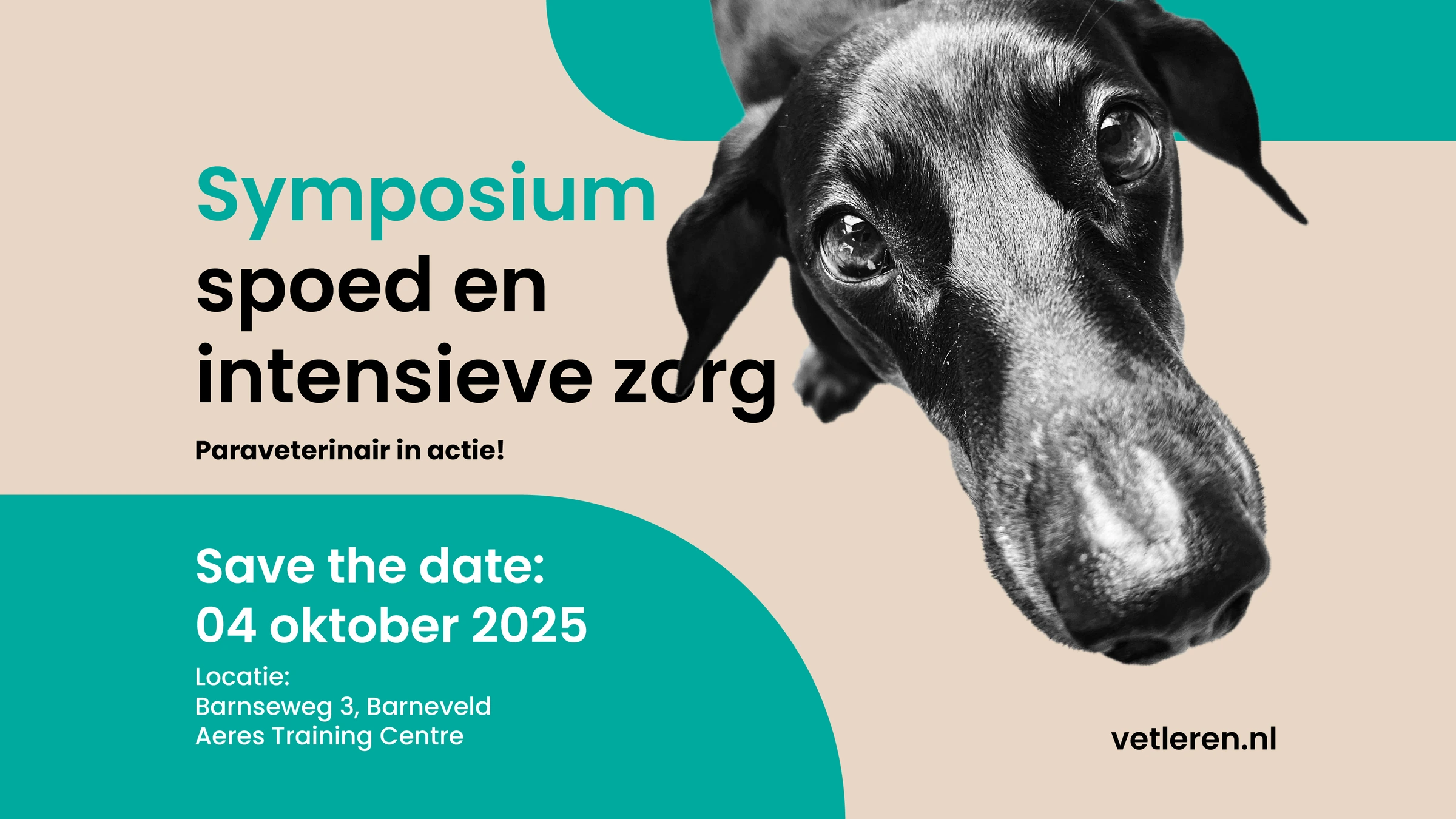
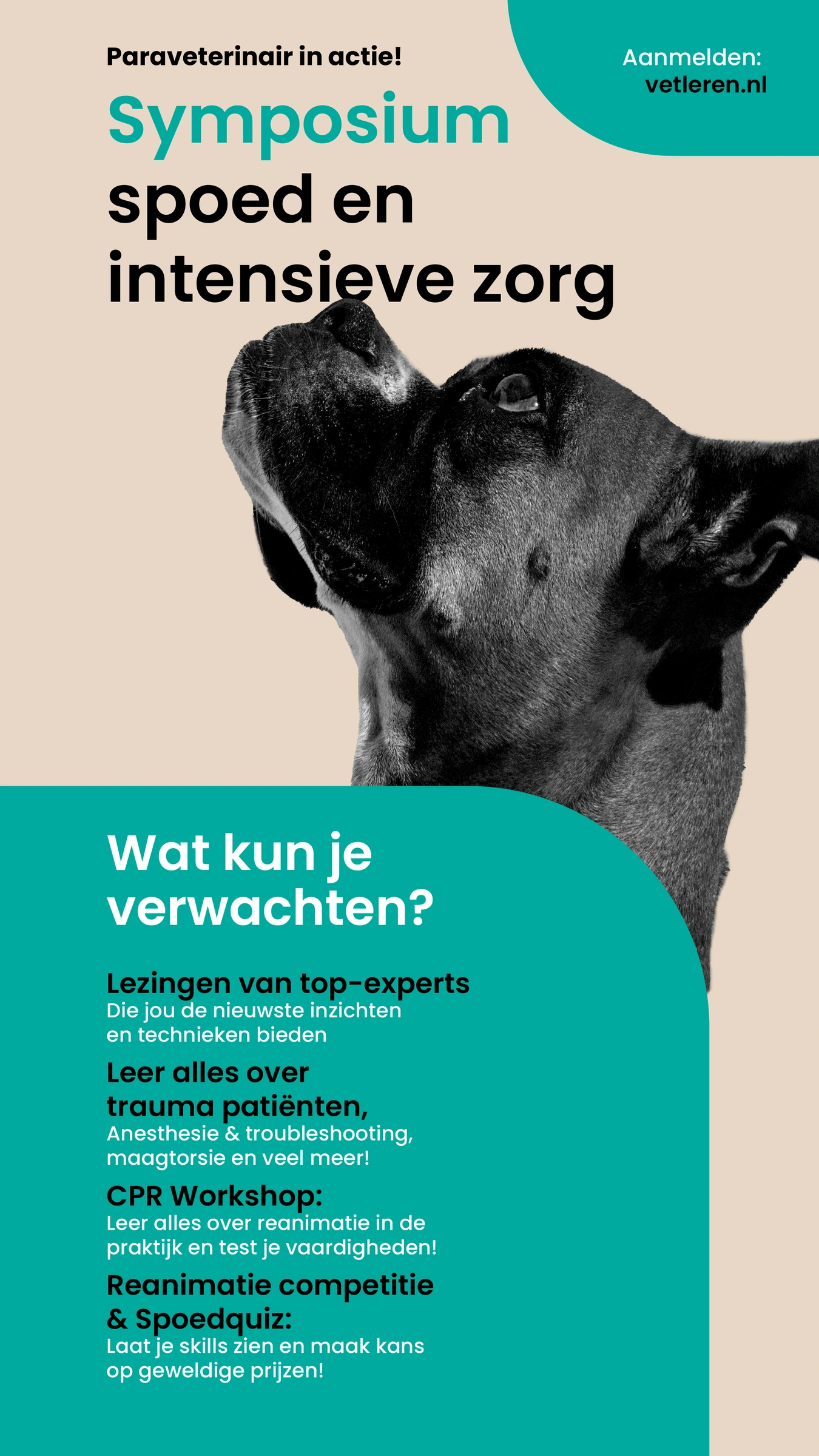
I developed the complete branding for Symposium Spoed en intensieve zorg — Paraveterinair in actie, an annual event for paraveterinary professionals and veterinarians.
The brief: a trustworthy identity with a clear medical character and an unmistakable connection to veterinary care.
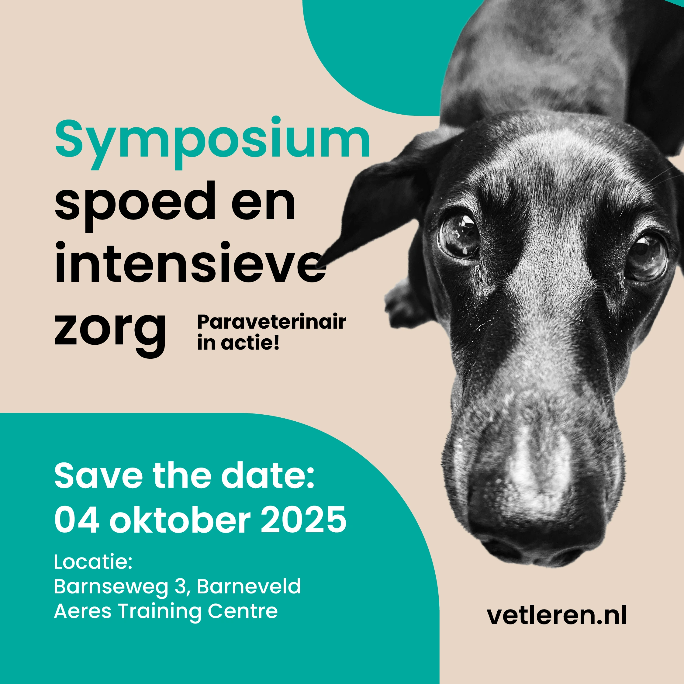
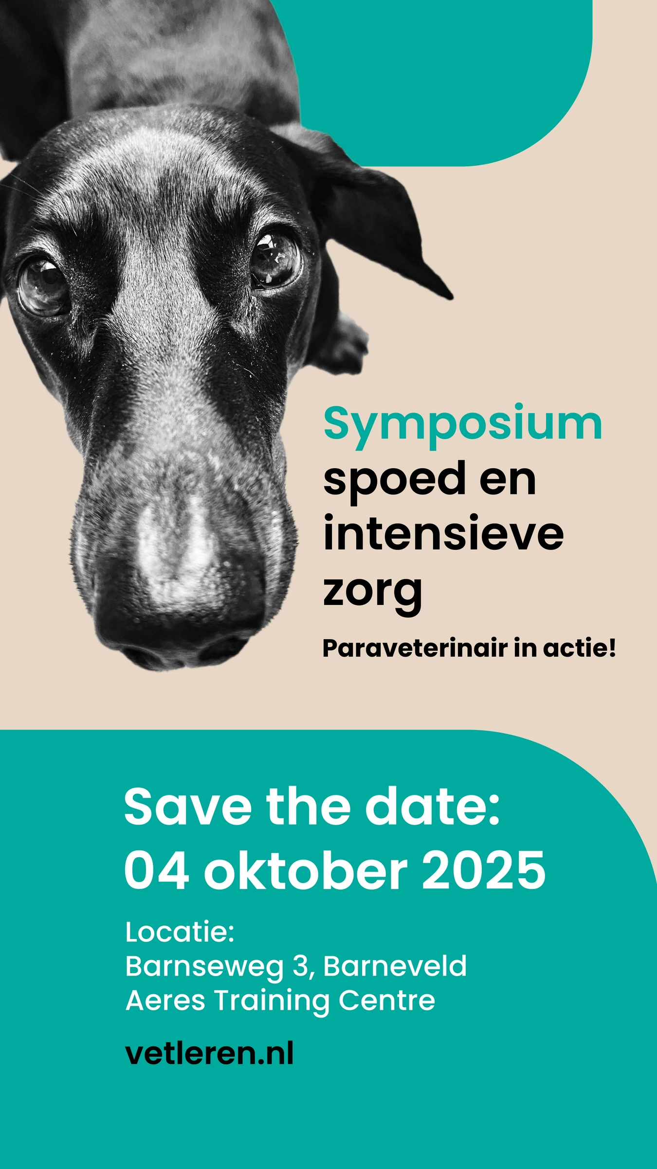
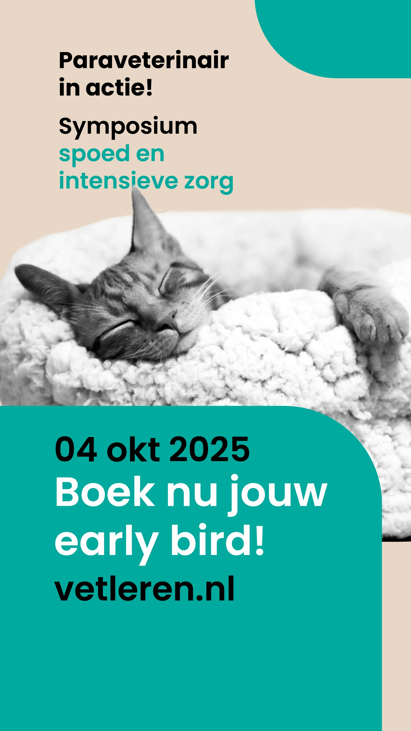
Save the date / The event identity applied to the 2025 edition.
01 / VISUAL IDENTITY
Clinical clarity. Animal character.
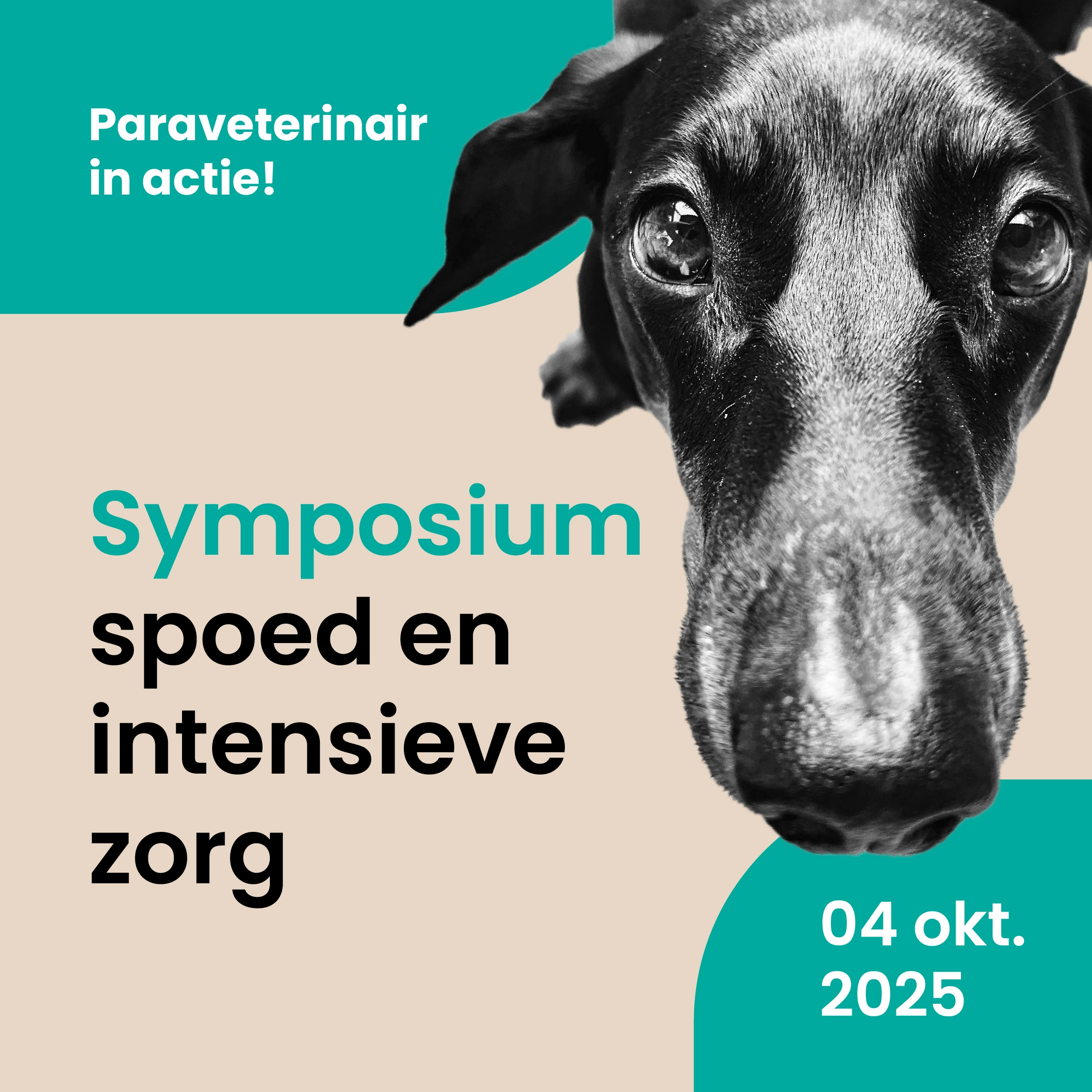
I paired teal and warm beige with clear typography and black-and-white animal imagery. The animals make the veterinary focus immediate; the restrained palette and structured layouts support the professional tone.
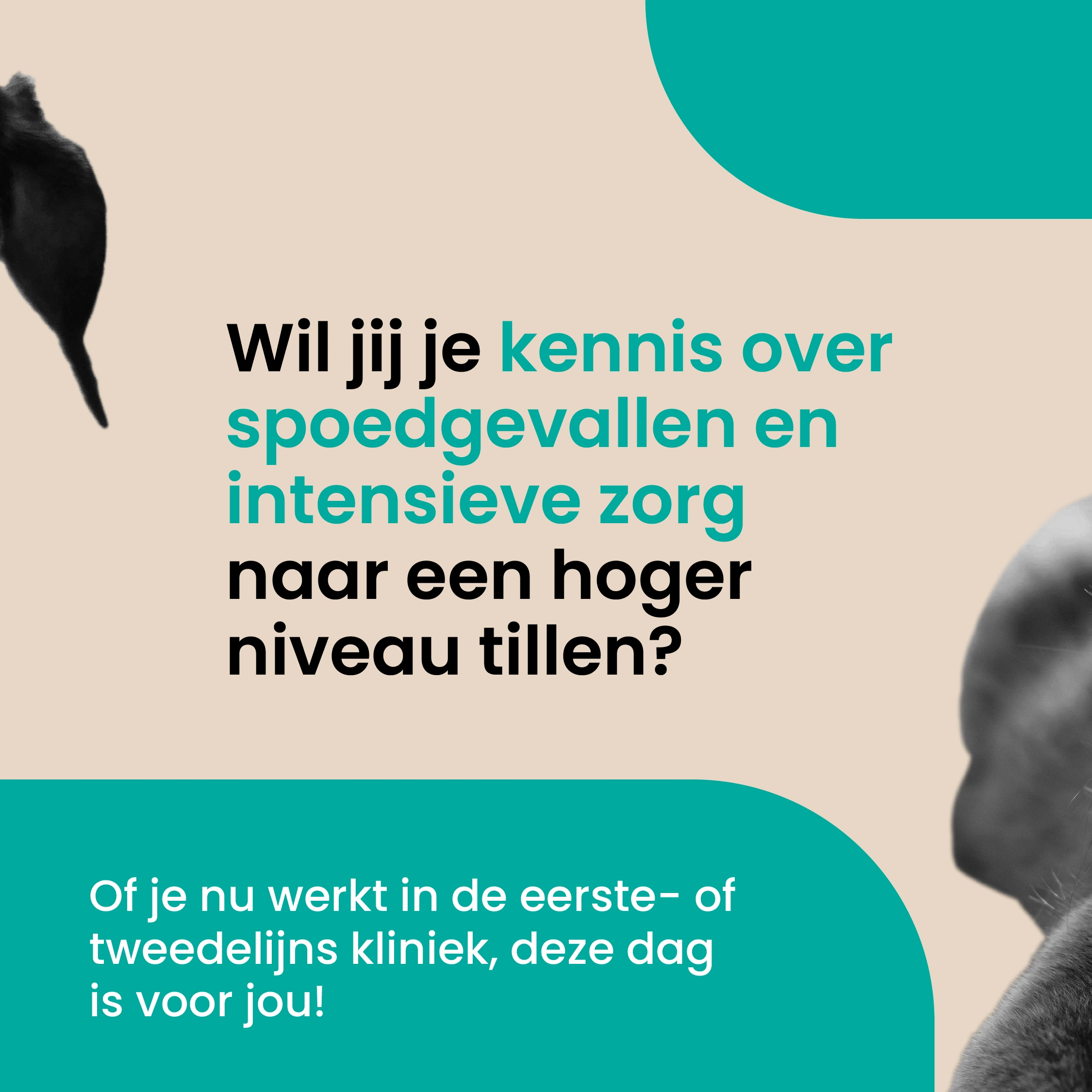
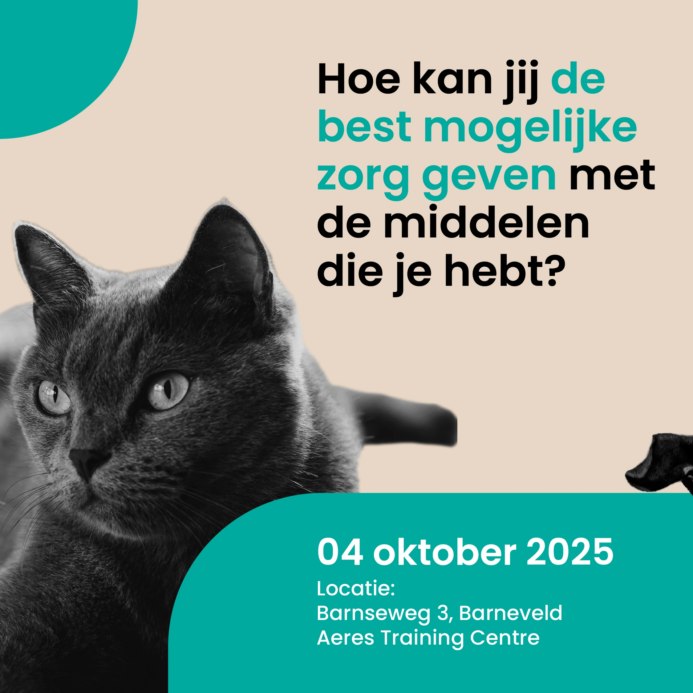
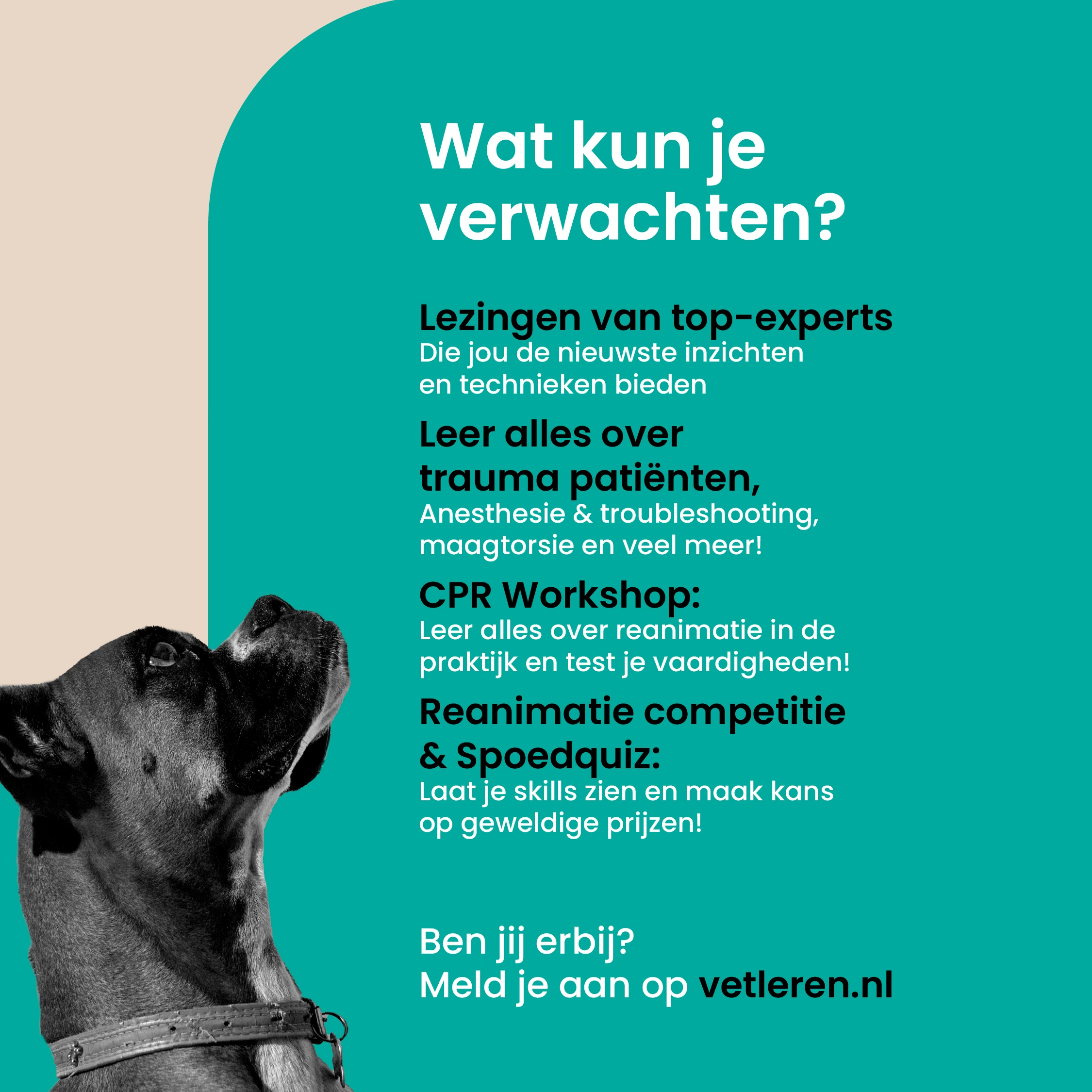
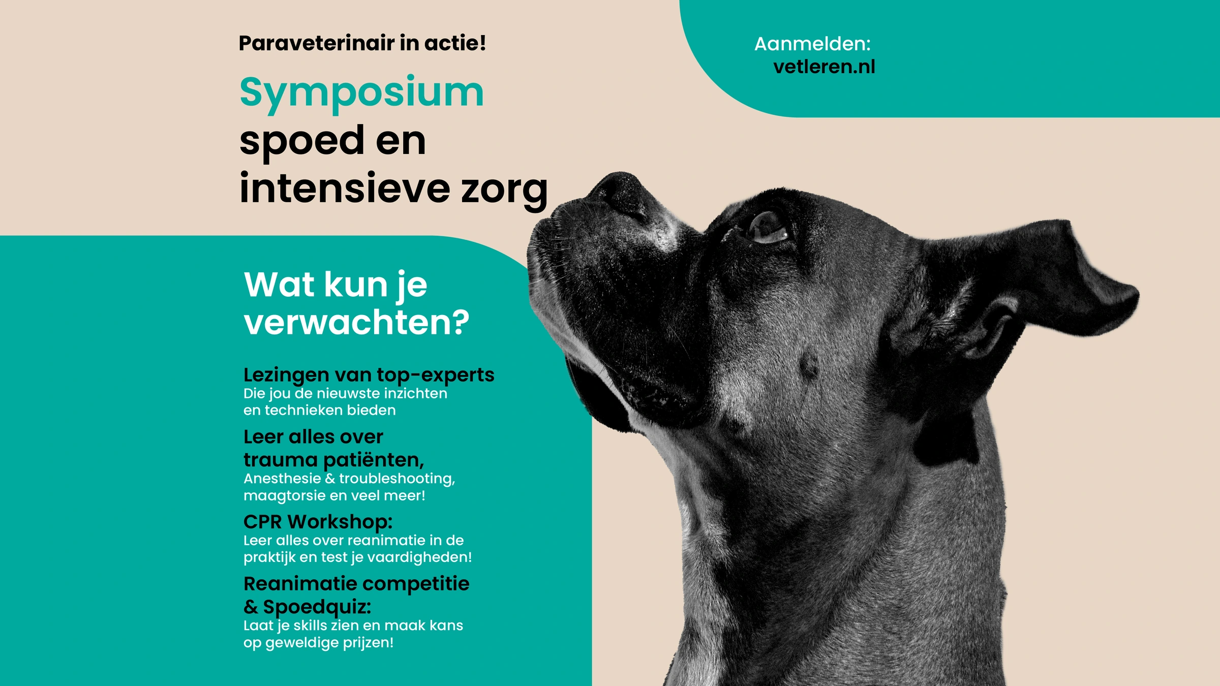
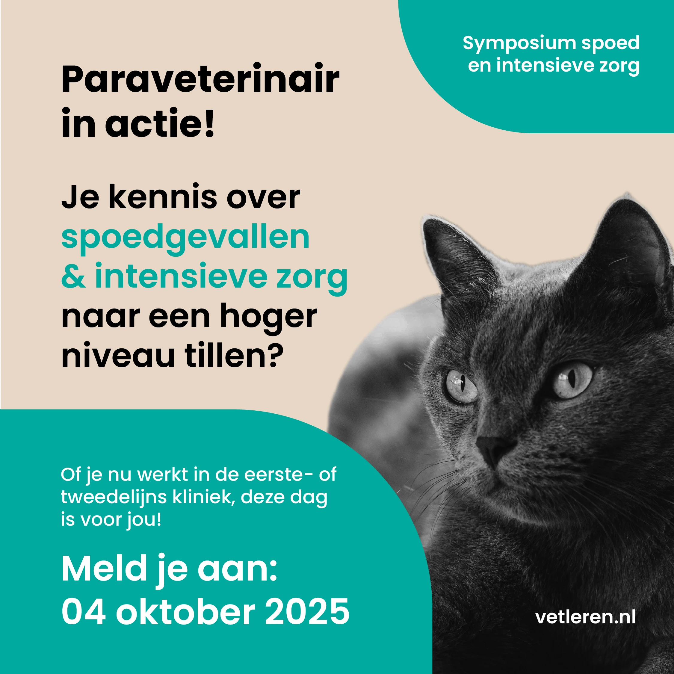
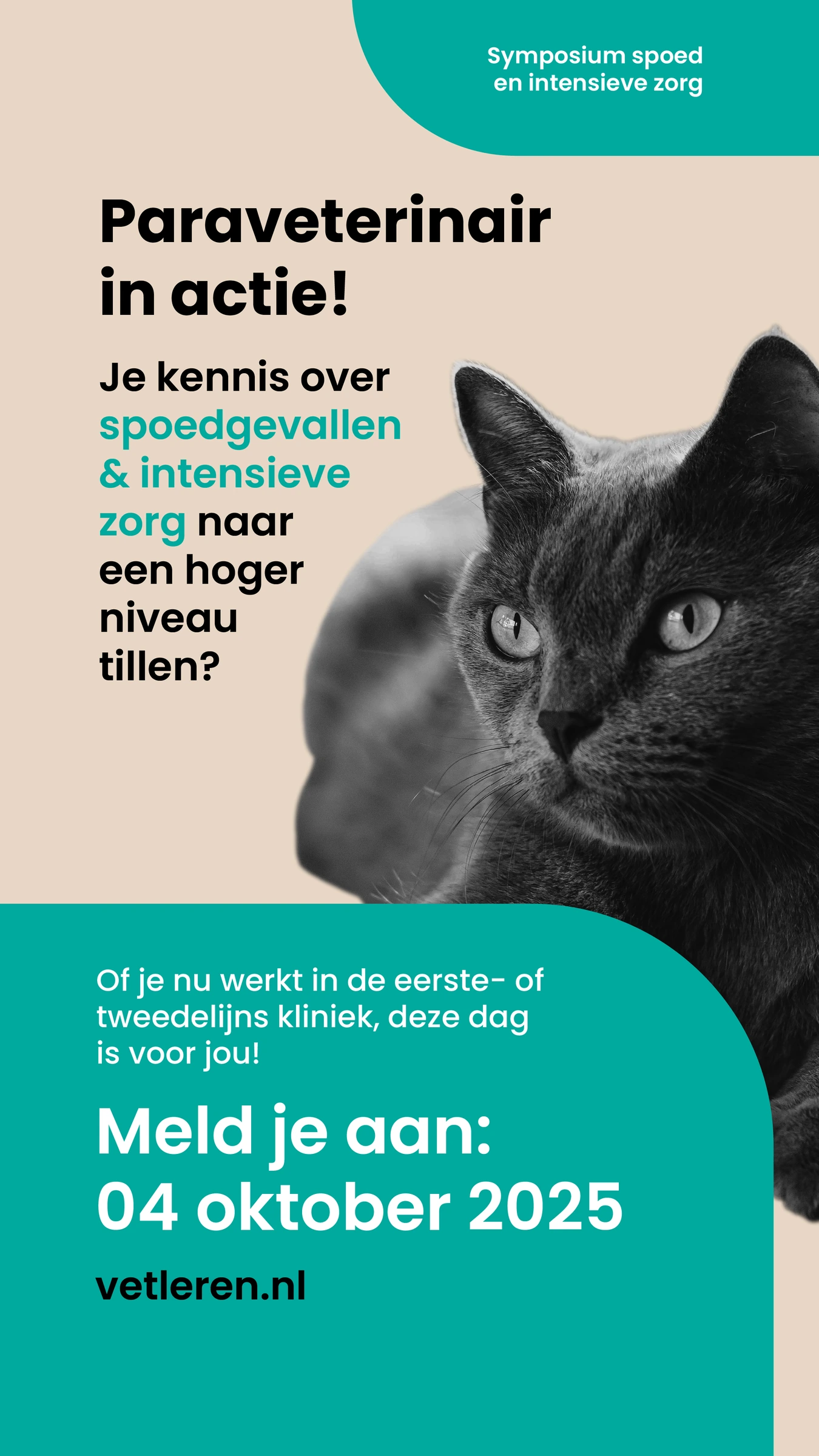
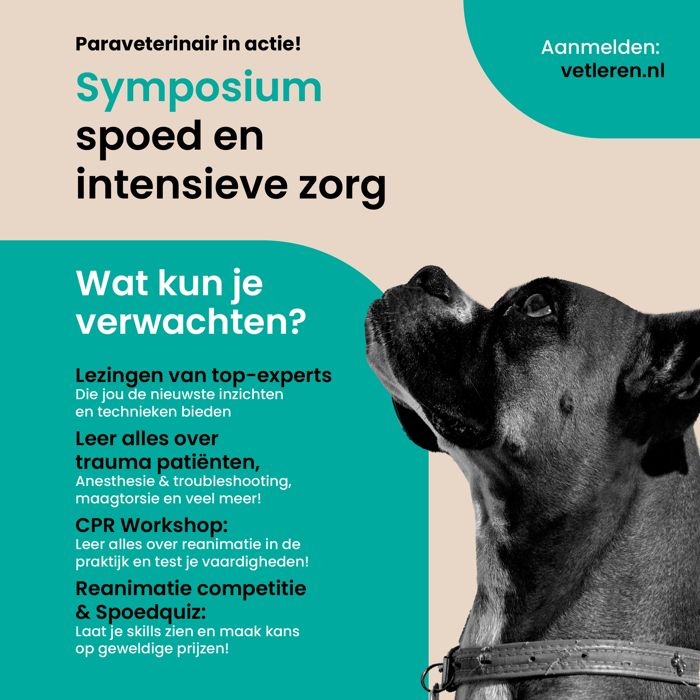
Rounded fields organise titles, key dates and practical information. I used this visual language throughout the campaign, including a four-part carousel that moves from the event introduction to its content and registration.
THE FOUR-PART CAROUSEL
01 / Introducing the symposium.
02 / Building knowledge in emergency and intensive care.
03 / Connecting the theme to clinical practice.
04 / Programme highlights and registration.
Swipe or use the arrows to browse. Select an image to enlarge it.
02 / SPEAKER ANNOUNCEMENTS
One identity. Every speaker.
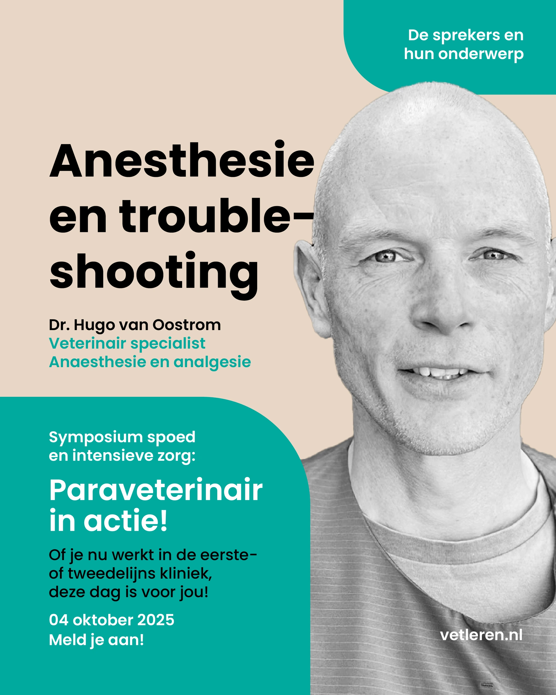
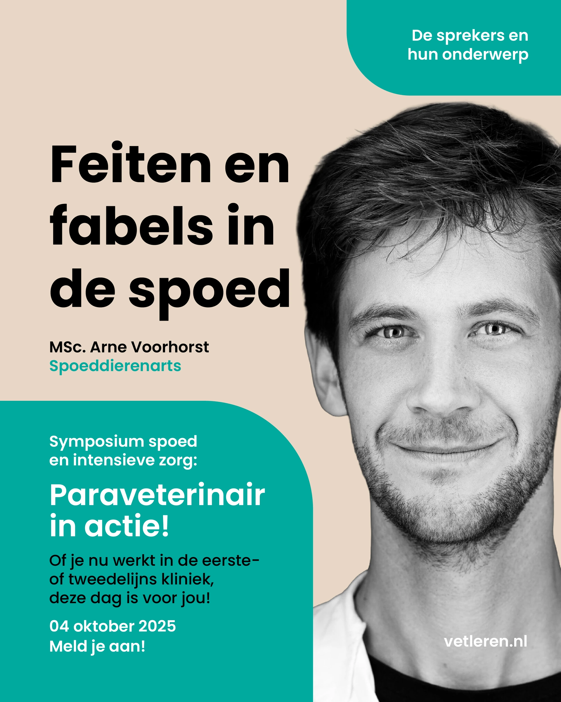
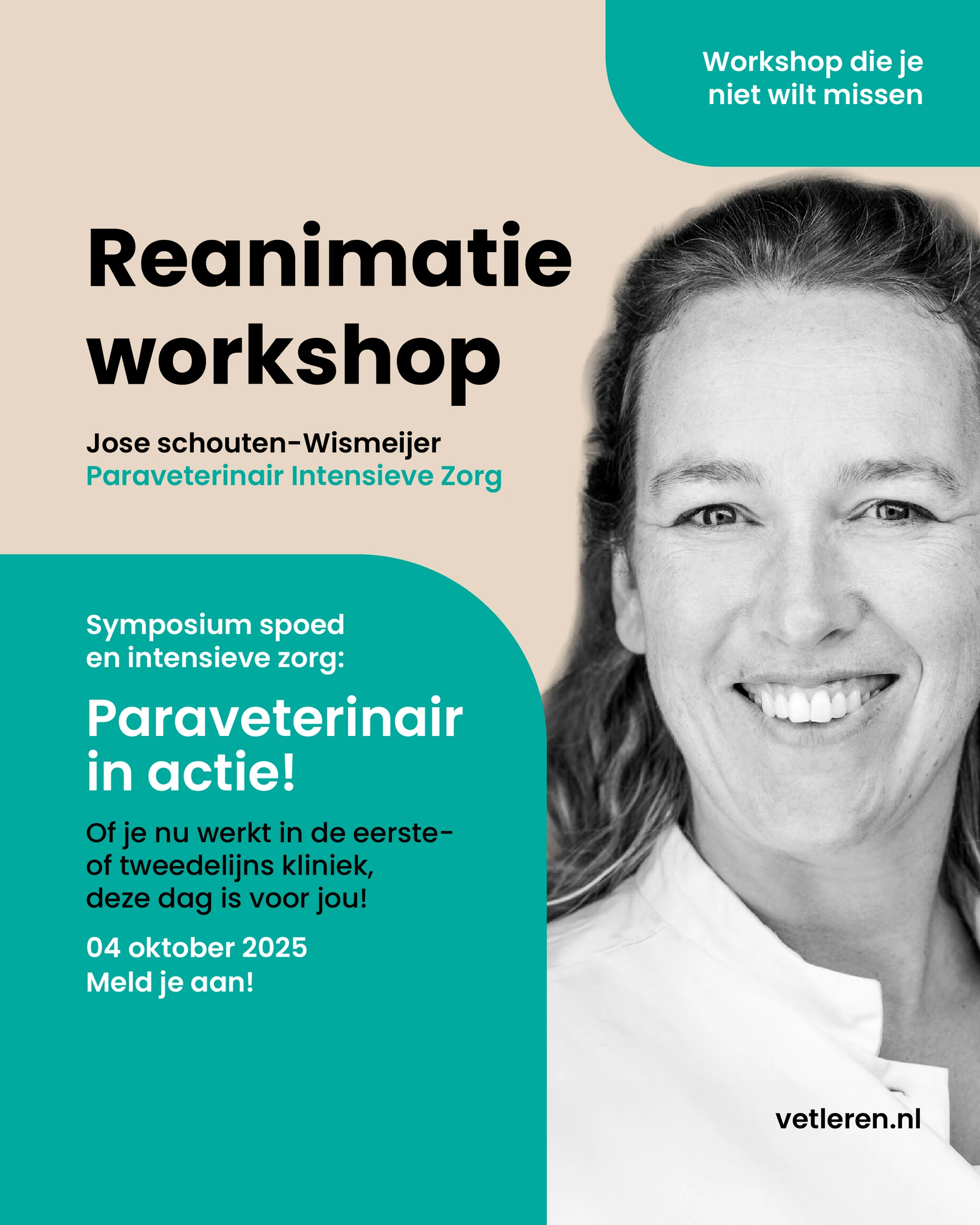
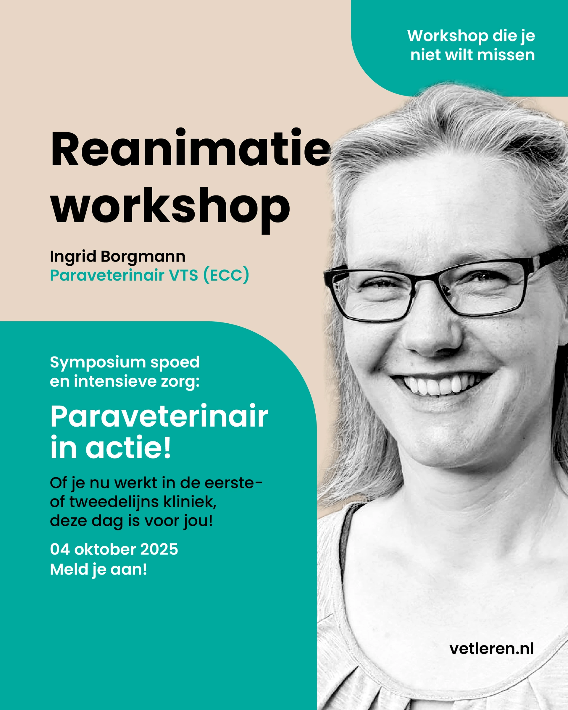
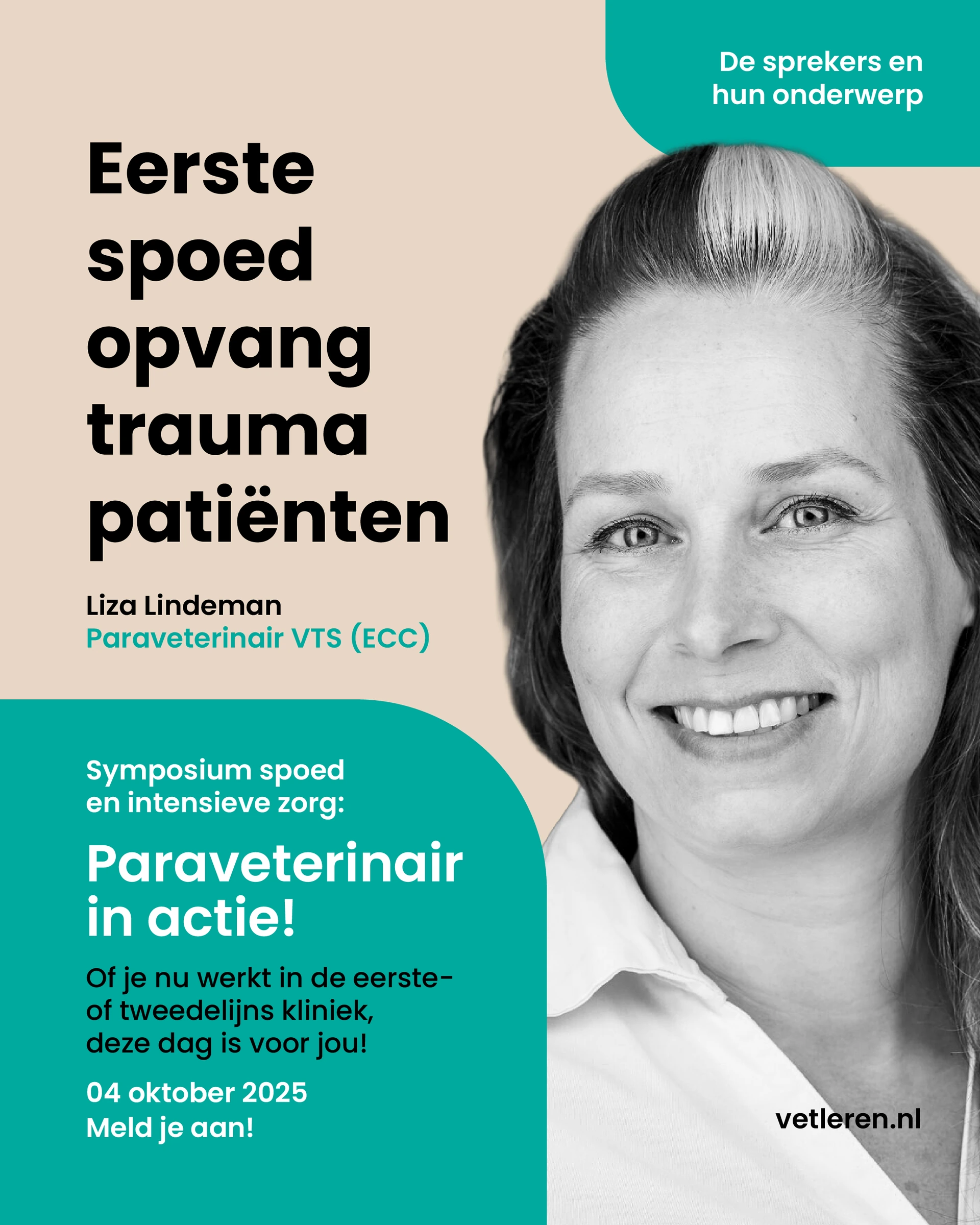
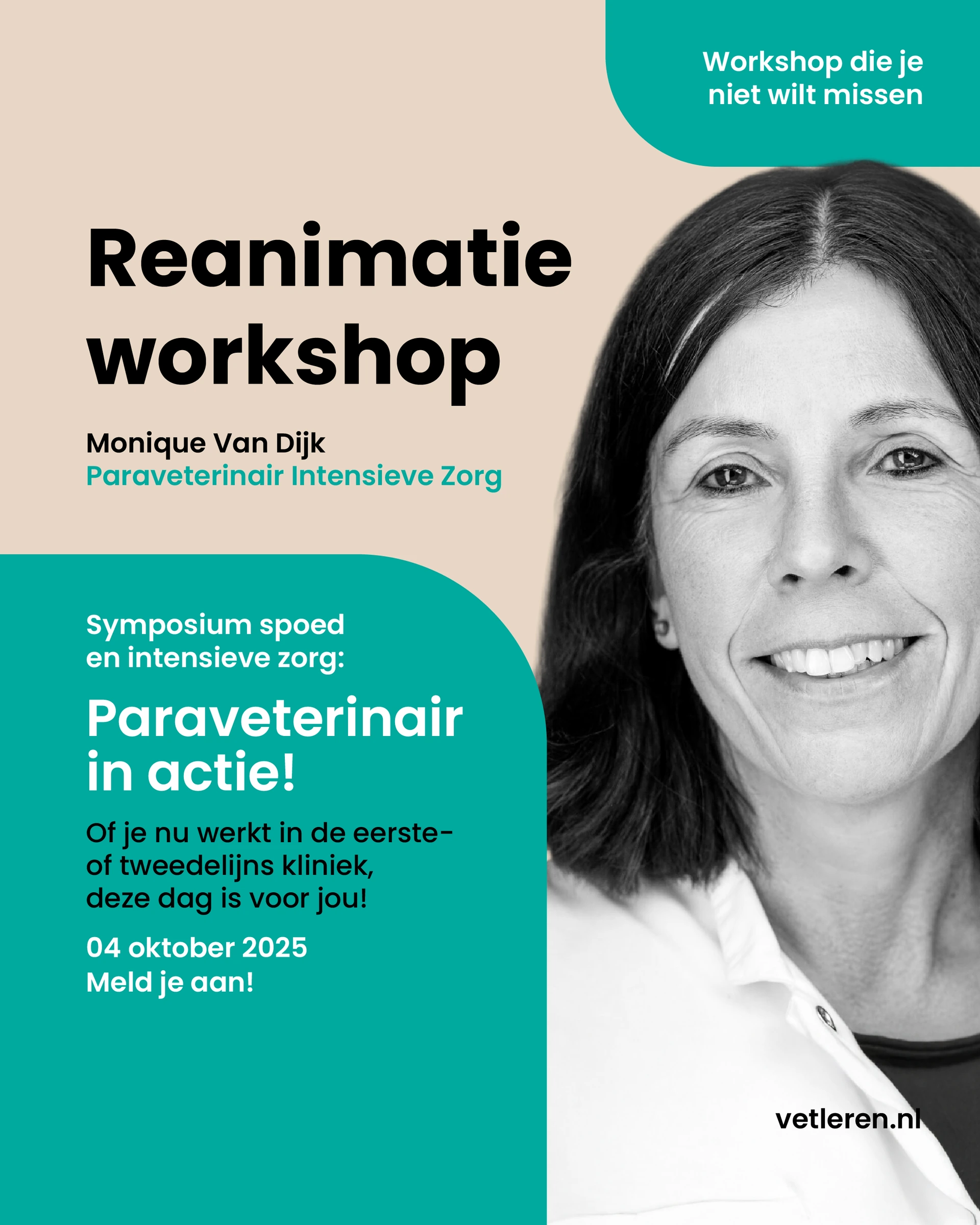
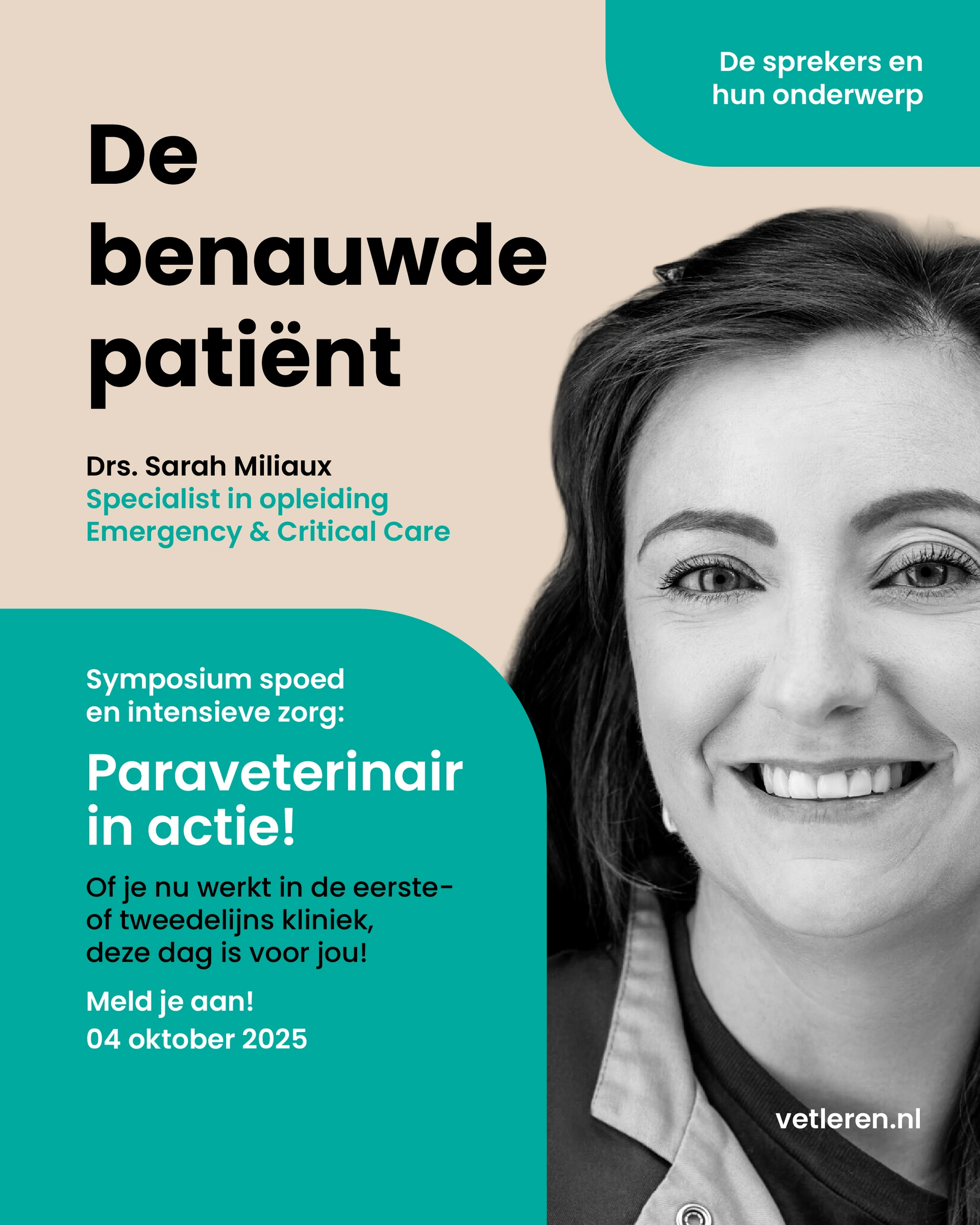
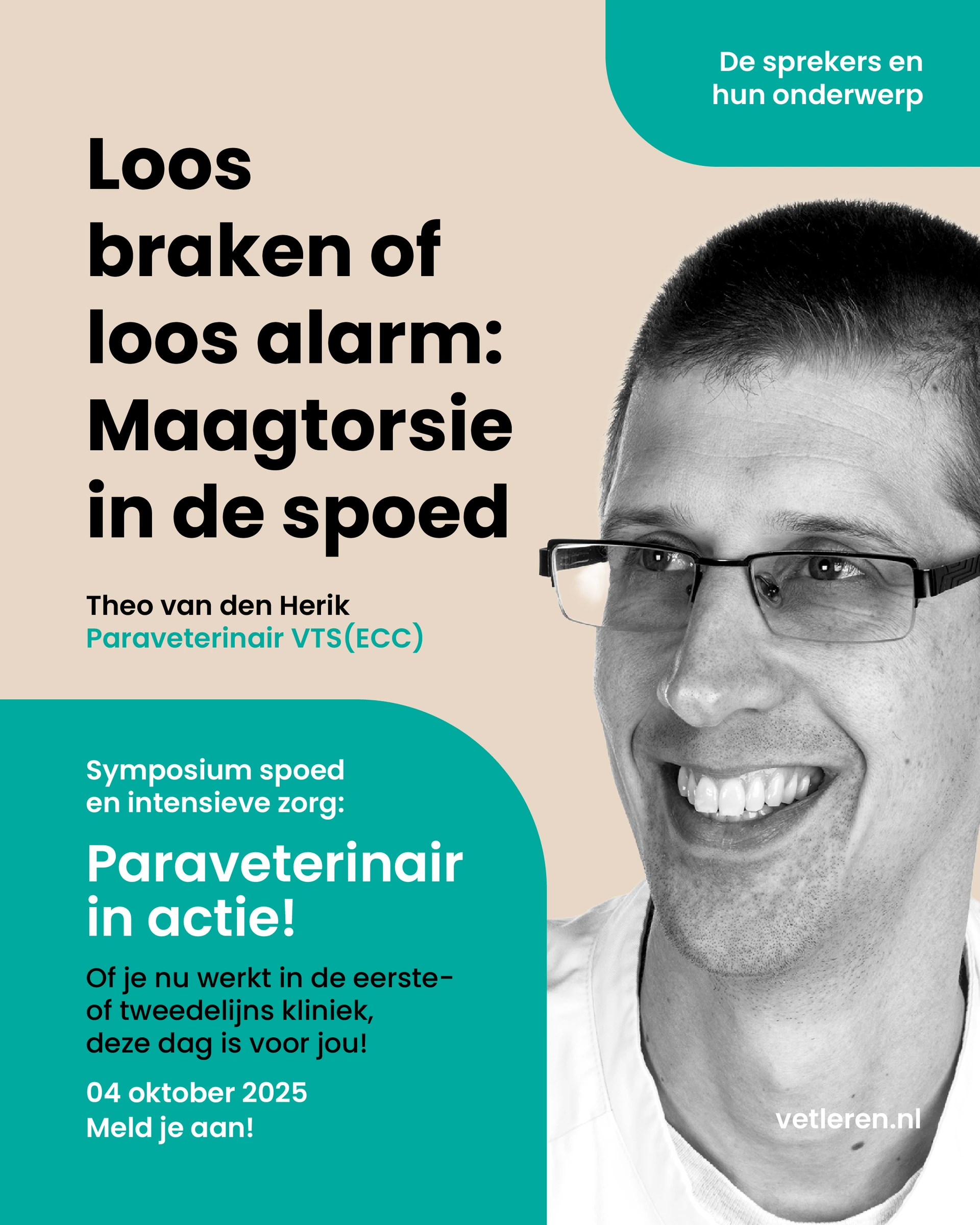
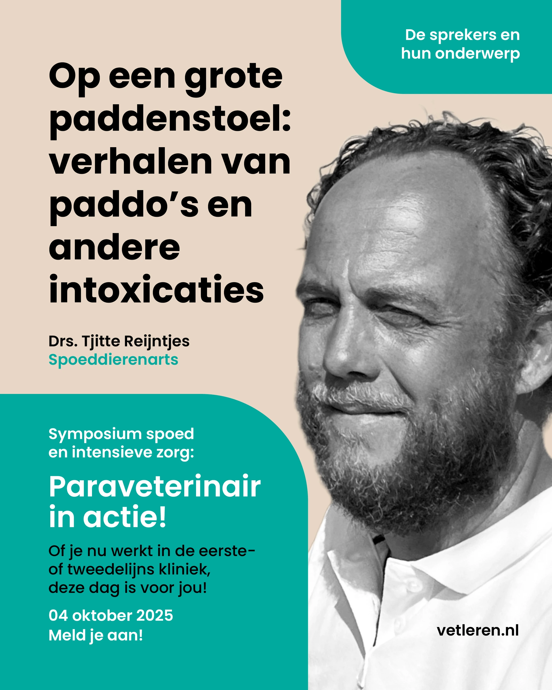
I extended the animal-led visual language to the speakers and workshop leaders. Black-and-white cut-out portraits use the same scale, rounded colour fields and typography, connecting the experts to the wider event identity.
I designed a consistent series in which each portrait, name and subject has a clear place. The visual link between animals and people makes the speaker announcements part of the same campaign.
SPEAKERS & WORKSHOP LEADERS
Hugo van Oostrom / Anaesthesia and troubleshooting.
Arne Voorhorst / Facts and myths in emergency care.
Jose Schouten-Wismeijer / Resuscitation workshop.
Ingrid Borgmann / Resuscitation workshop.
Liza Lindeman / Initial care for trauma patients.
Monique van Dijk / Resuscitation workshop.
Sarah Miliaux / The patient with breathing difficulties.
Theo van den Herik / Gastric torsion in emergency care.
Tjitte Reijntjes / Toxicology in emergency care.
Swipe or use the arrows to browse. Select an image to enlarge it.
03 / CAMPAIGN DESIGN
One event. A complete campaign.
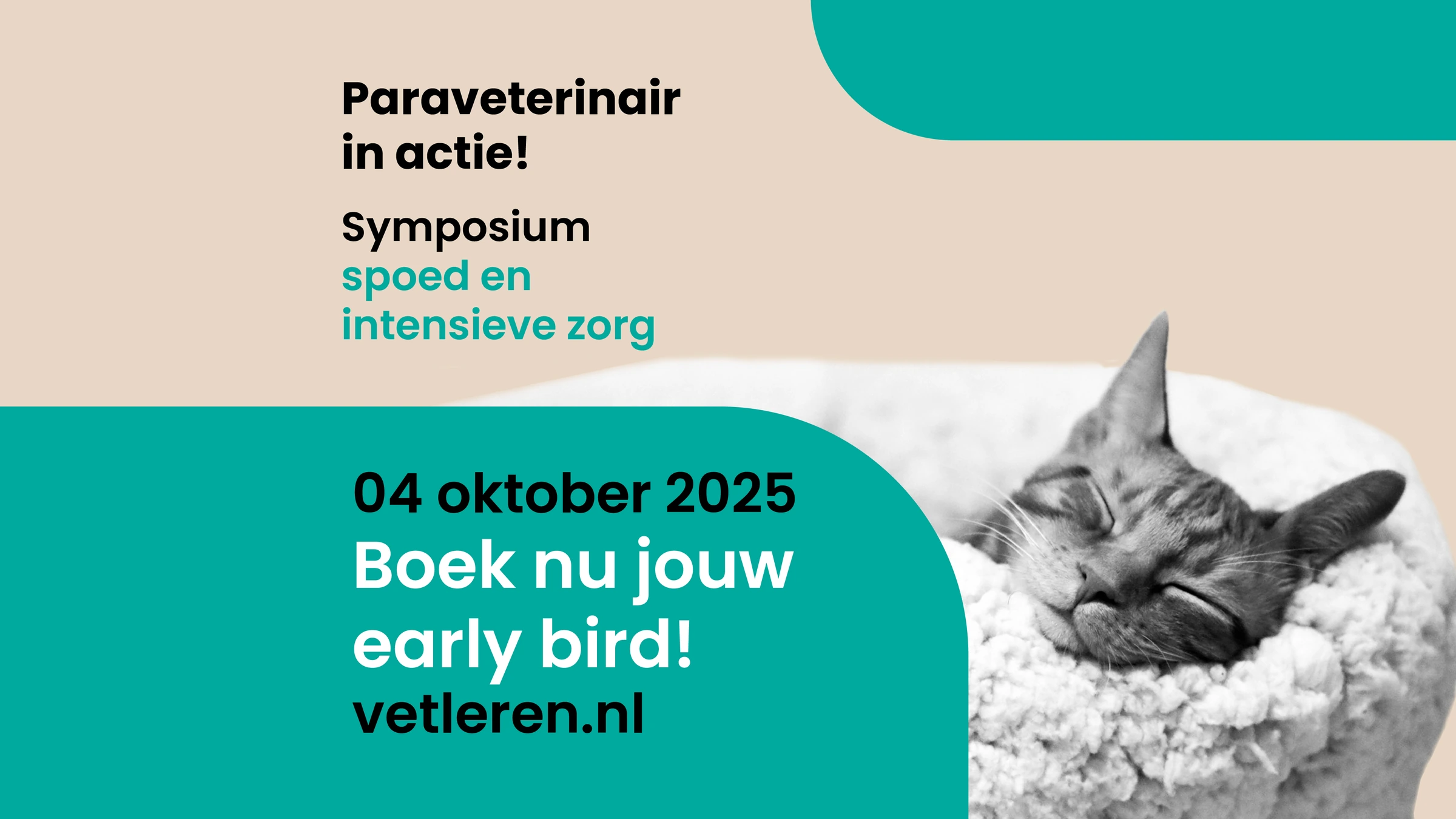
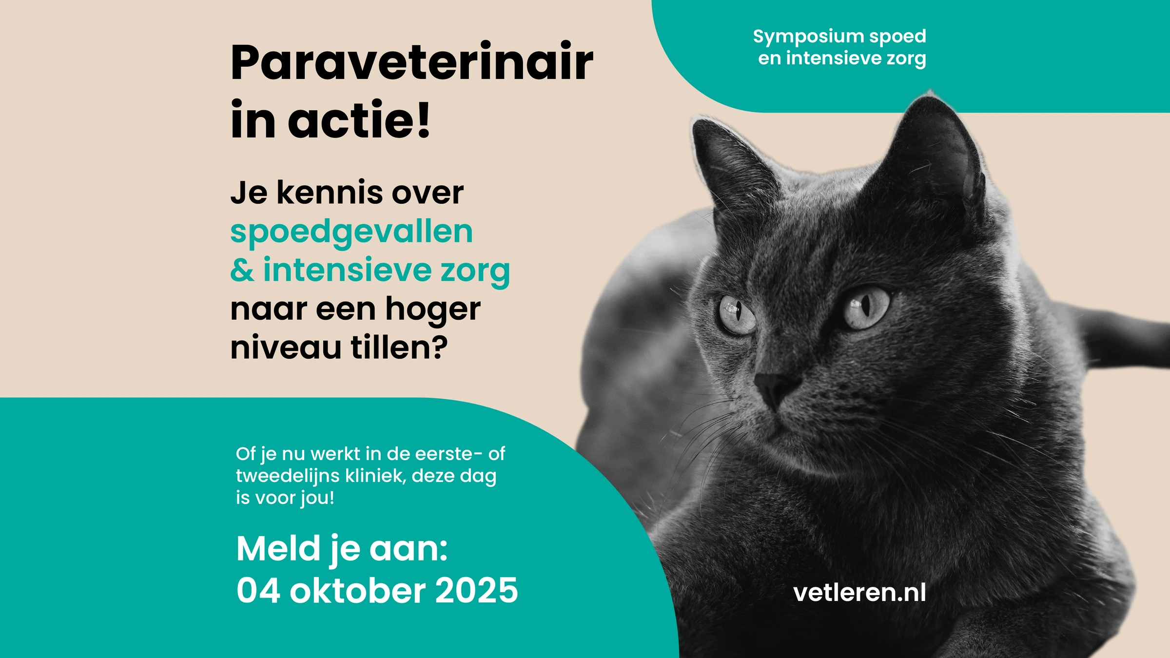
I designed a connected set of announcements for the save the date, early bird registration, professional development and programme. Each message has its own composition within the same identity.
The layouts accommodate both short invitations and detailed programme information, keeping the event name, subject and next step clearly ordered.
CAMPAIGN / LINKEDIN
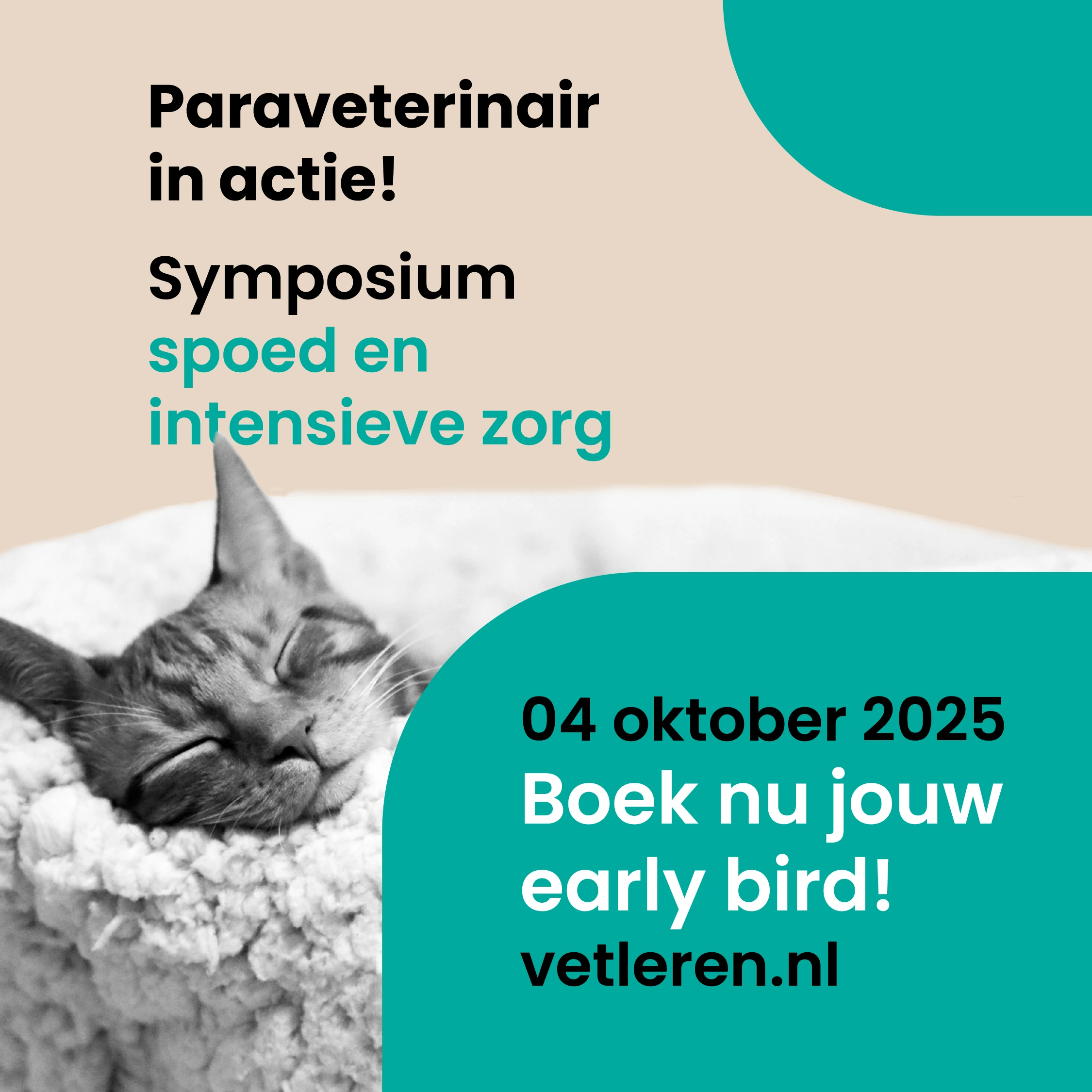
Early bird / Registration announcement for the 2025 edition.
Professional development / The value of taking part.
Programme / Making a content-rich announcement easy to scan.
Swipe or use the arrows to browse. Select an image to enlarge it.
04 / FORMAT ADAPTATION
Recognisable in every format.
I adapted the campaign for square posts, landscape LinkedIn visuals and vertical stories. I adjusted the image placement, line breaks and information hierarchy to suit each format.
The examples below show the square and vertical versions together, from the first announcement through to the programme.
SQUARE POSTS & VERTICAL STORIES
Save the date / Square post.Save the date / Vertical story.
Early bird / Square post.Early bird / Vertical story.
Professional development / Square post.Professional development / Vertical story.
Swipe or use the arrows to browse. Select an image to enlarge it.
View the inspiration references +
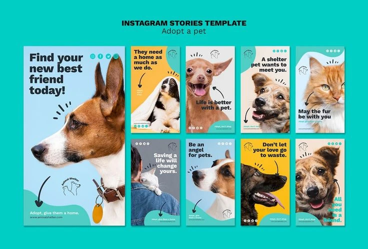
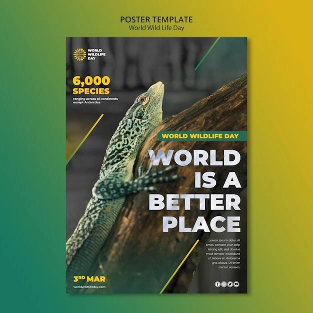
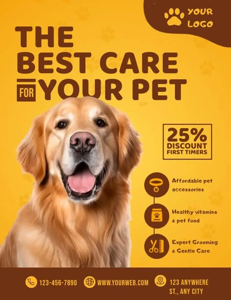
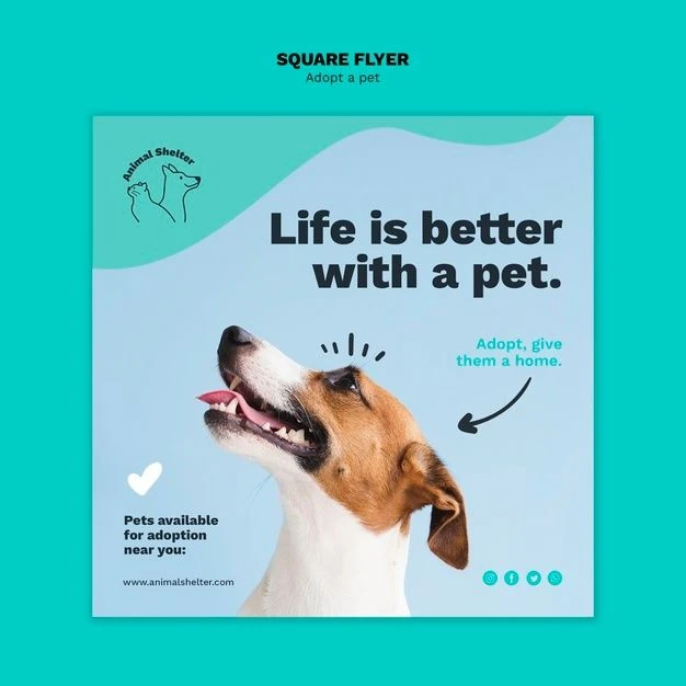
THIRD-PARTY REFERENCE MATERIAL
These supplied references informed the visual exploration: bold typography, prominent animal imagery and rounded colour fields. They are inspiration material by other designers. The symposium designs shown above are my work.