Bluetech needed a more distinctive presence. I evaluated agencies and reviewed their design and content proposals with the interim Marketing Manager. Henry Handsome designed the original visual identity.
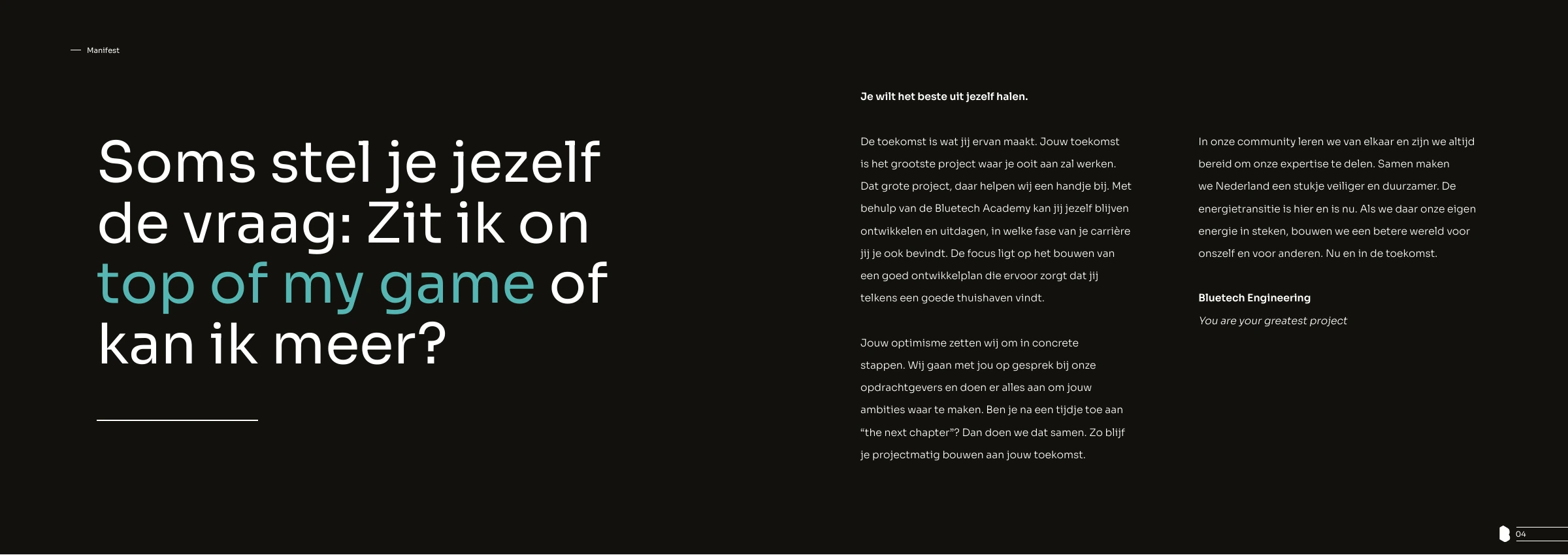
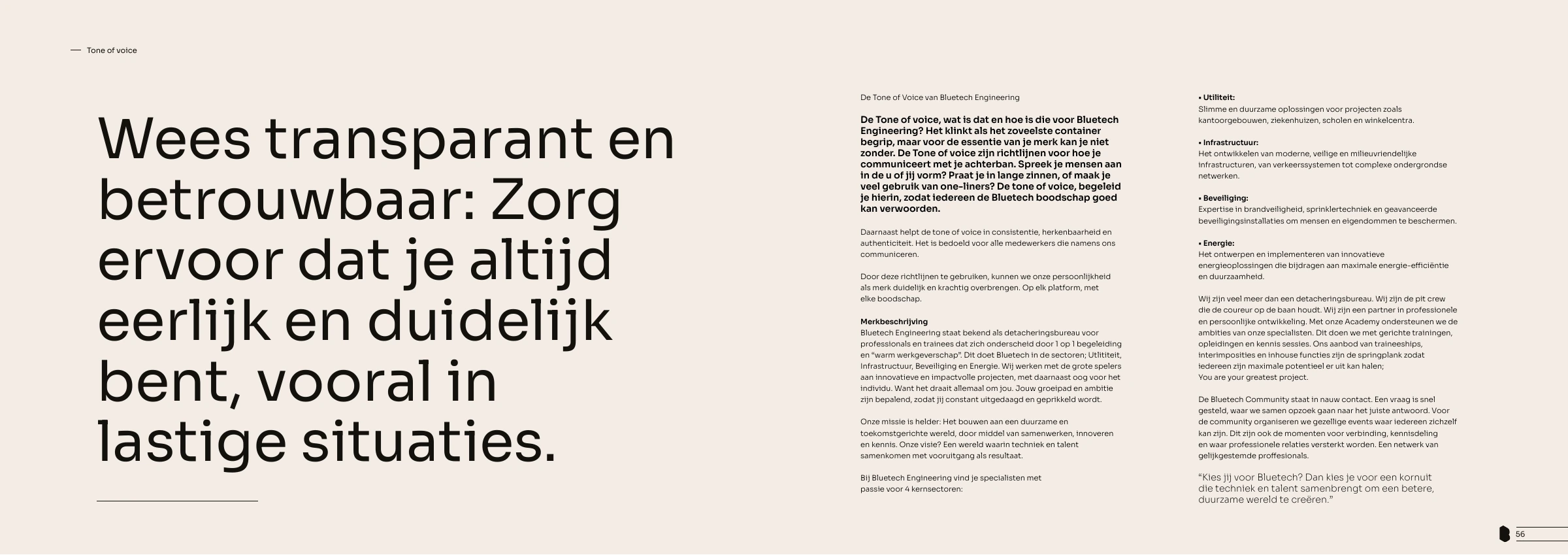
I wrote the manifesto, defined the tone of voice and developed the initial guidelines into a full brandbook. I rolled out the identity across office signage, HR documents, social media and advertising, and built the image library with my own photography.
I set the design direction for these applications and kept the identity consistent across different internal requests. When preferences conflicted, I weighed them against the audience and the brand guidelines.
THE EXPANDED BRANDBOOK
From brand direction to practical guidance.
1 / 6
The manifesto I wrote: personal development as the foundation of the brand.
Tone of voice: a shared reference for how Bluetech communicates.
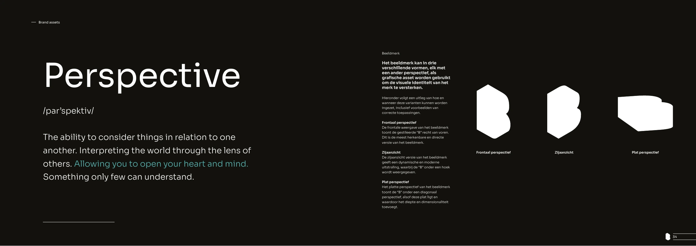
Documenting how the existing brand symbol can be applied.
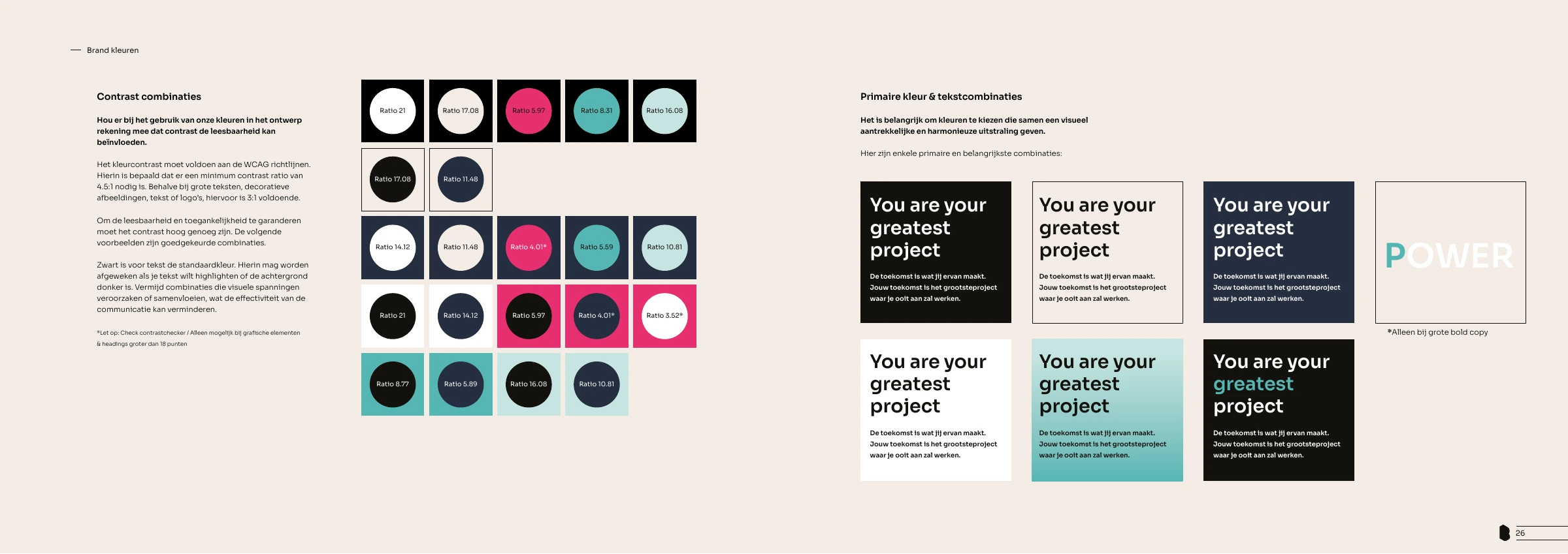
Practical colour and contrast guidance for consistent, readable applications.
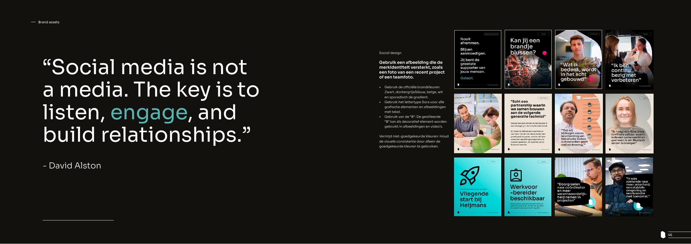
Translating the visual identity into guidance for social media.
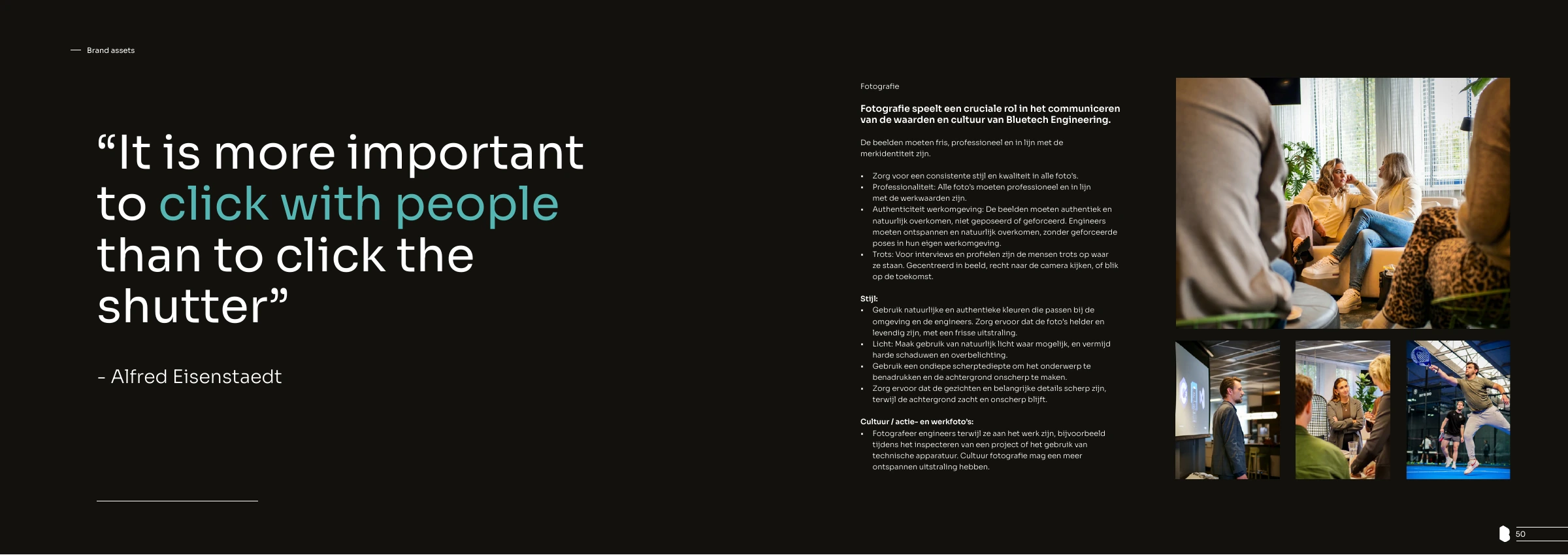
Photography guidance: people and their working environment at the centre.
Swipe or use the arrows to browse. Select an image to enlarge it.
PRESENTATION SYSTEM / POWERPOINT
A template to build on.
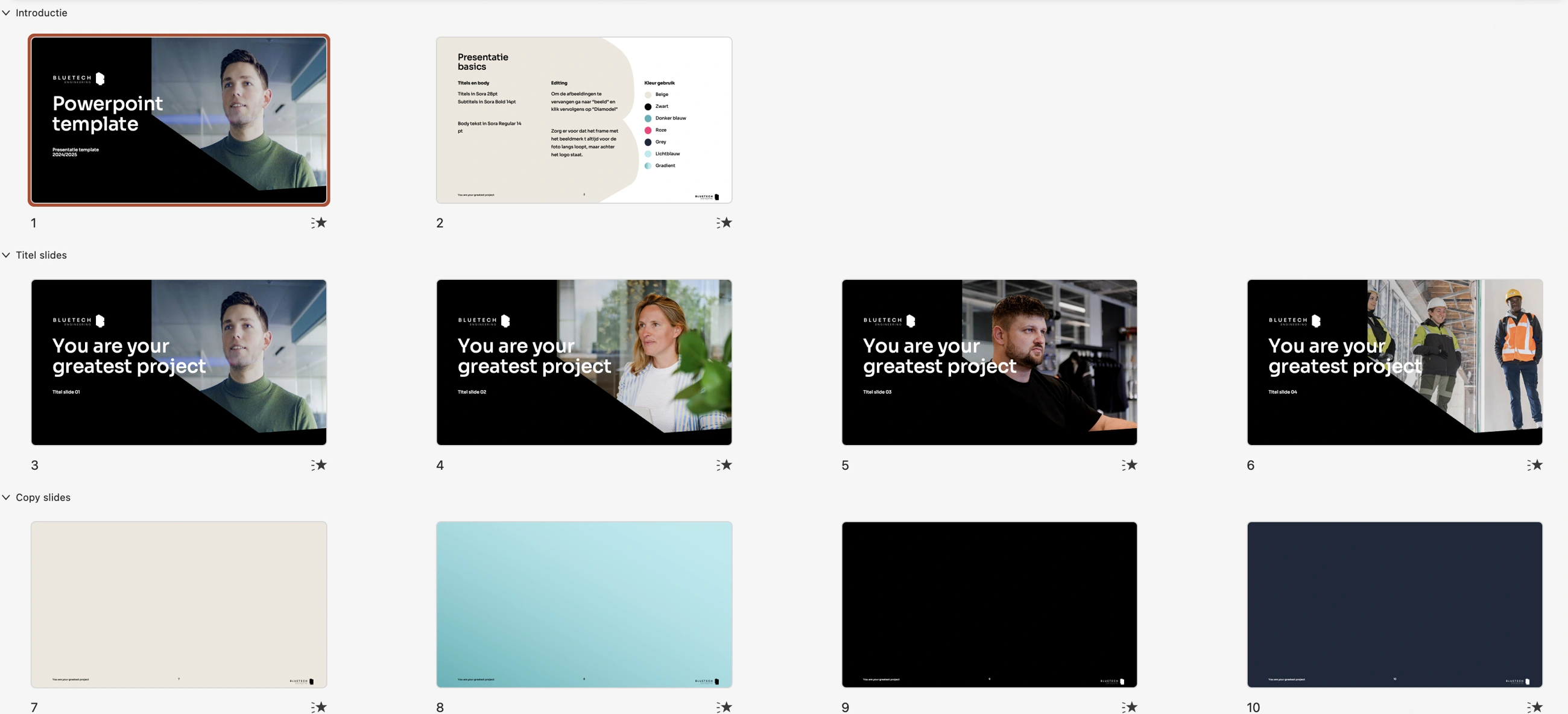
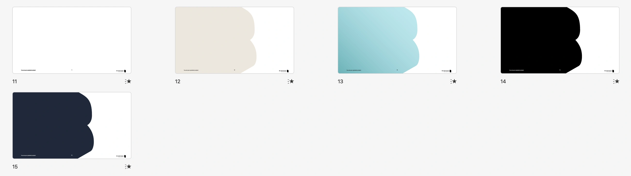
I developed the Bluetech Engineering PowerPoint template as a set of reusable layouts. The presentation basics document how to use typography, colours and images.
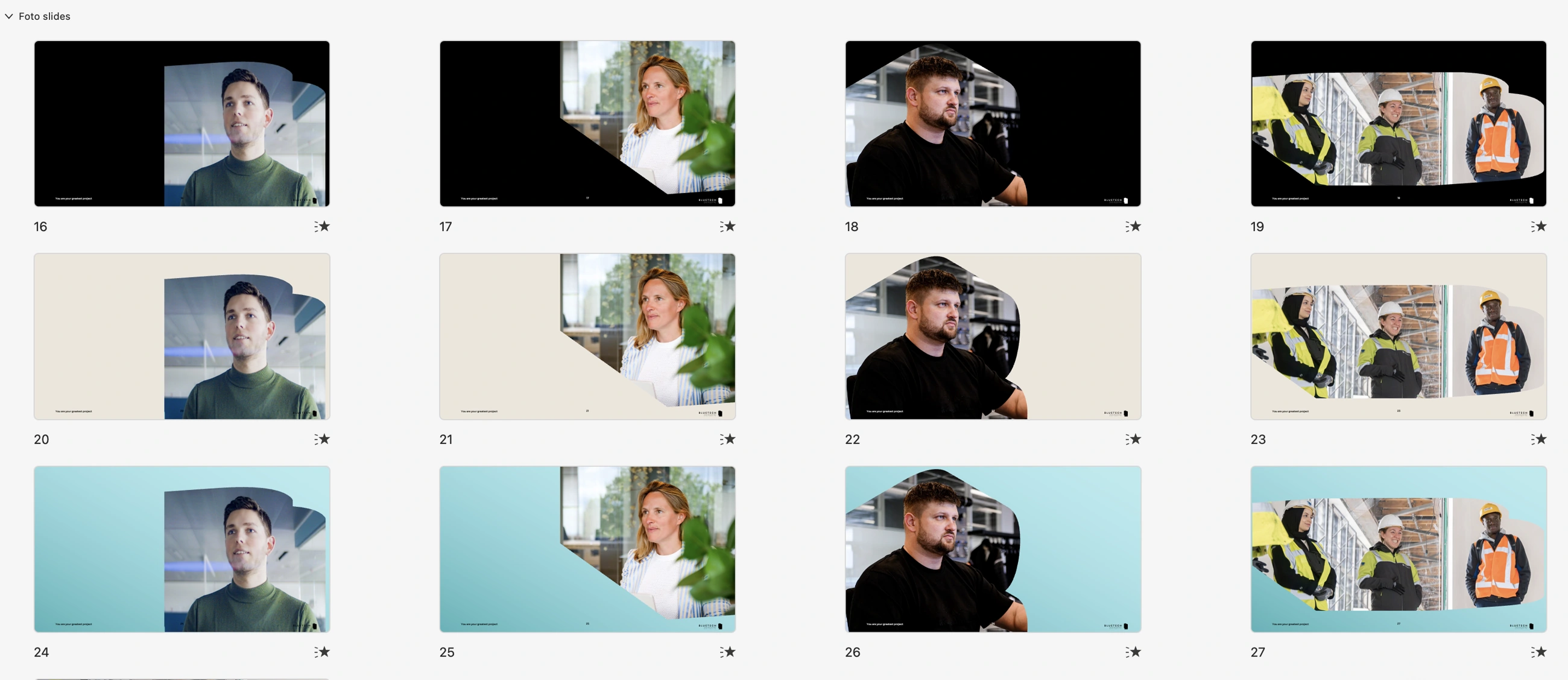
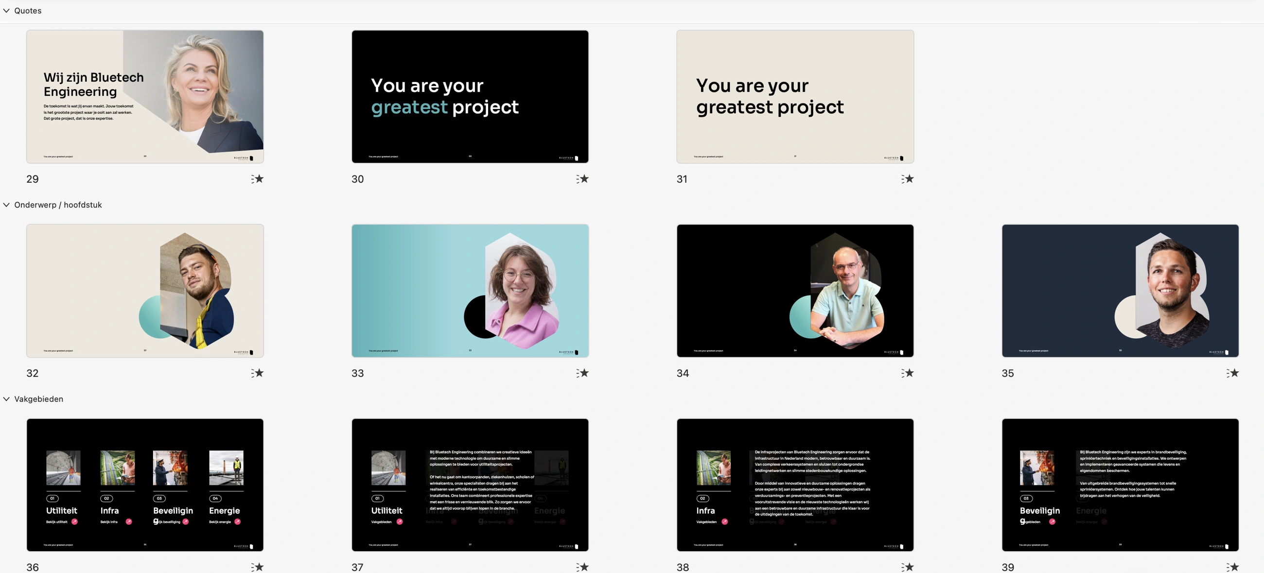
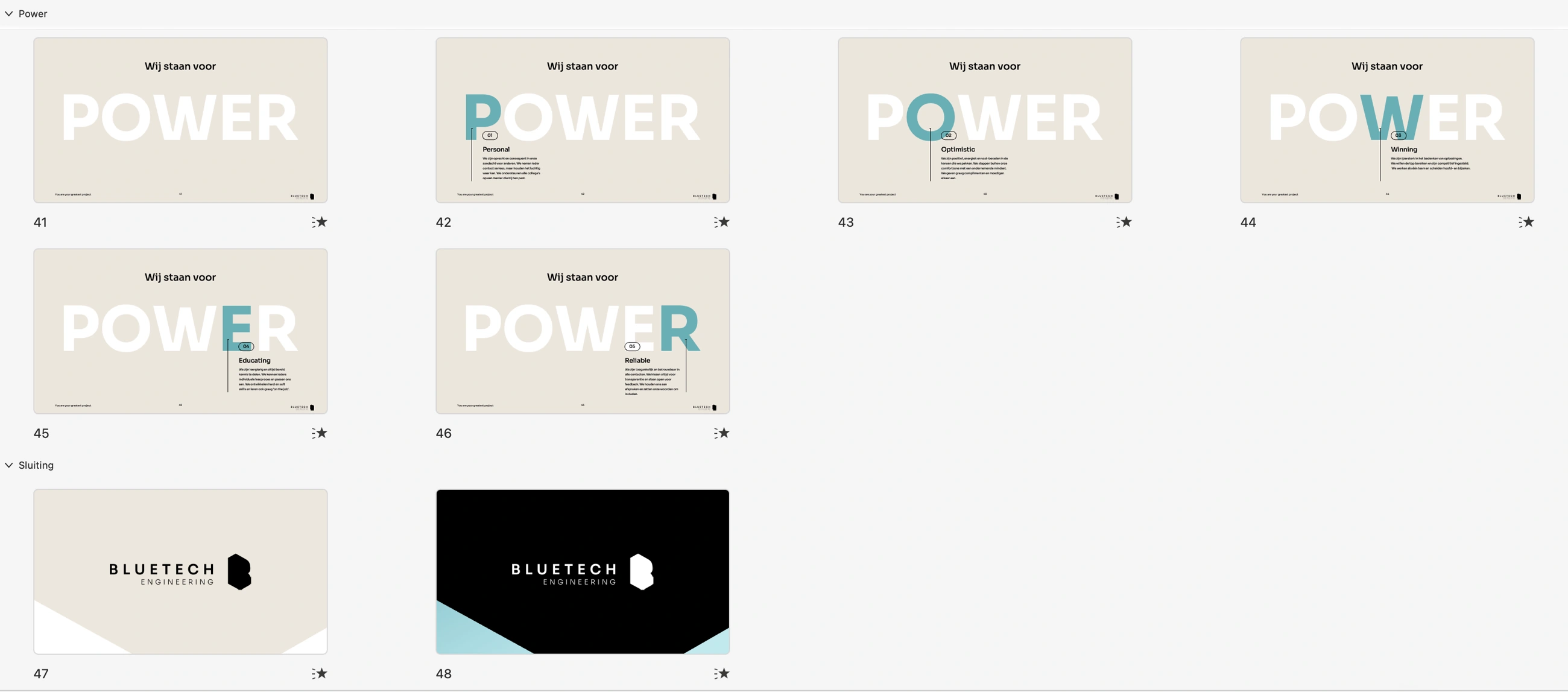
The system includes title and copy slides, photographic layouts, quotes, chapter openers, the POWER values and closing slides. These overviews show how the brand elements work together across the template.
BLUETECH ENGINEERING / POWERPOINT TEMPLATE
Guidance and reusable layouts within one presentation system.
1 / 5
Introduction & title slides — PowerPoint template overview: opening slides, presentation basics and title layouts.
Working layouts — Reusable copy layouts with the Bluetech brand shape and palette.
Photography layouts — Photographic layouts using different perspectives of the Bluetech brand symbol.
Quotes & chapter openers — Quote slides, chapter openers and technical disciplines within one presentation system.
Values & closing slides — The POWER values sequence and closing slides in the same template.
Swipe or use the arrows to browse. Select an image to enlarge it.
02 / CAMPAIGNS
One identity. Different conversations.
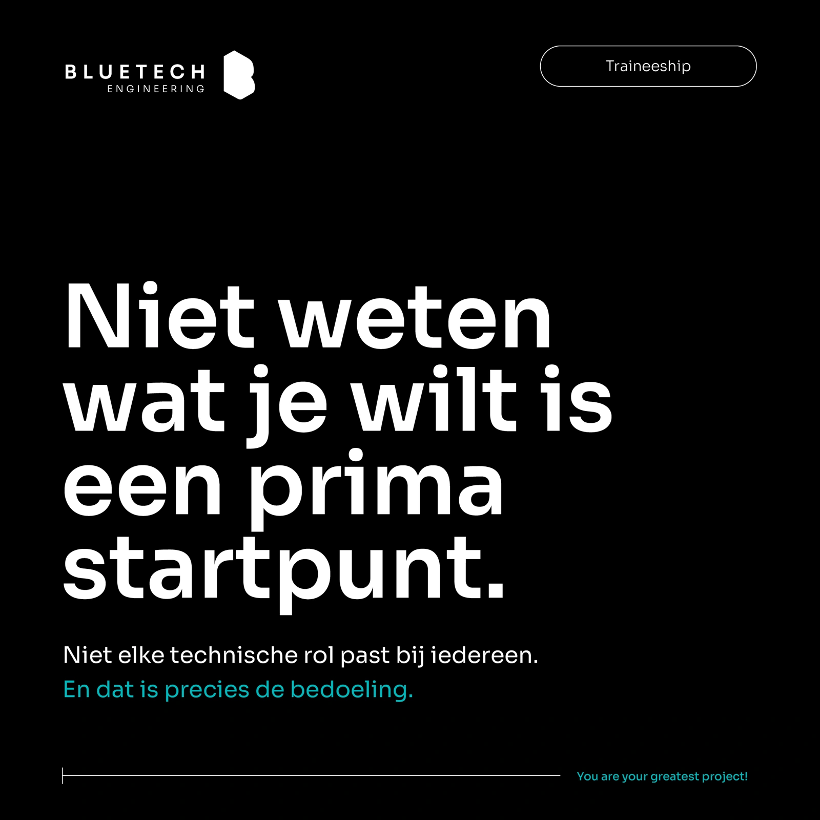
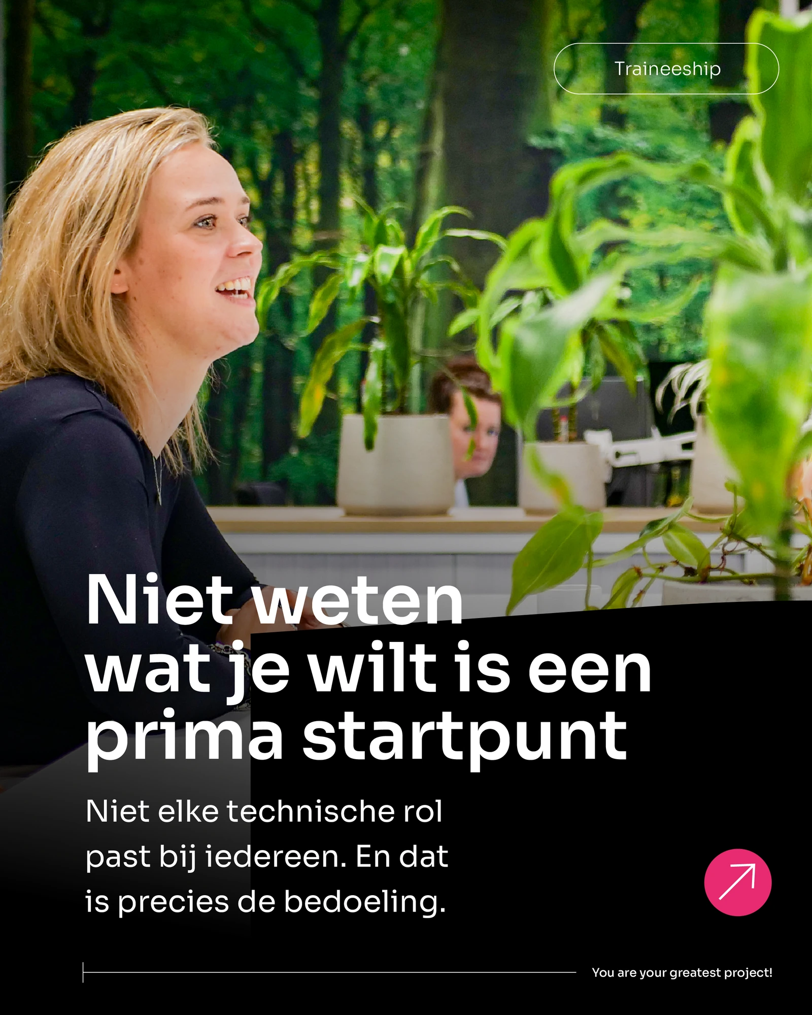
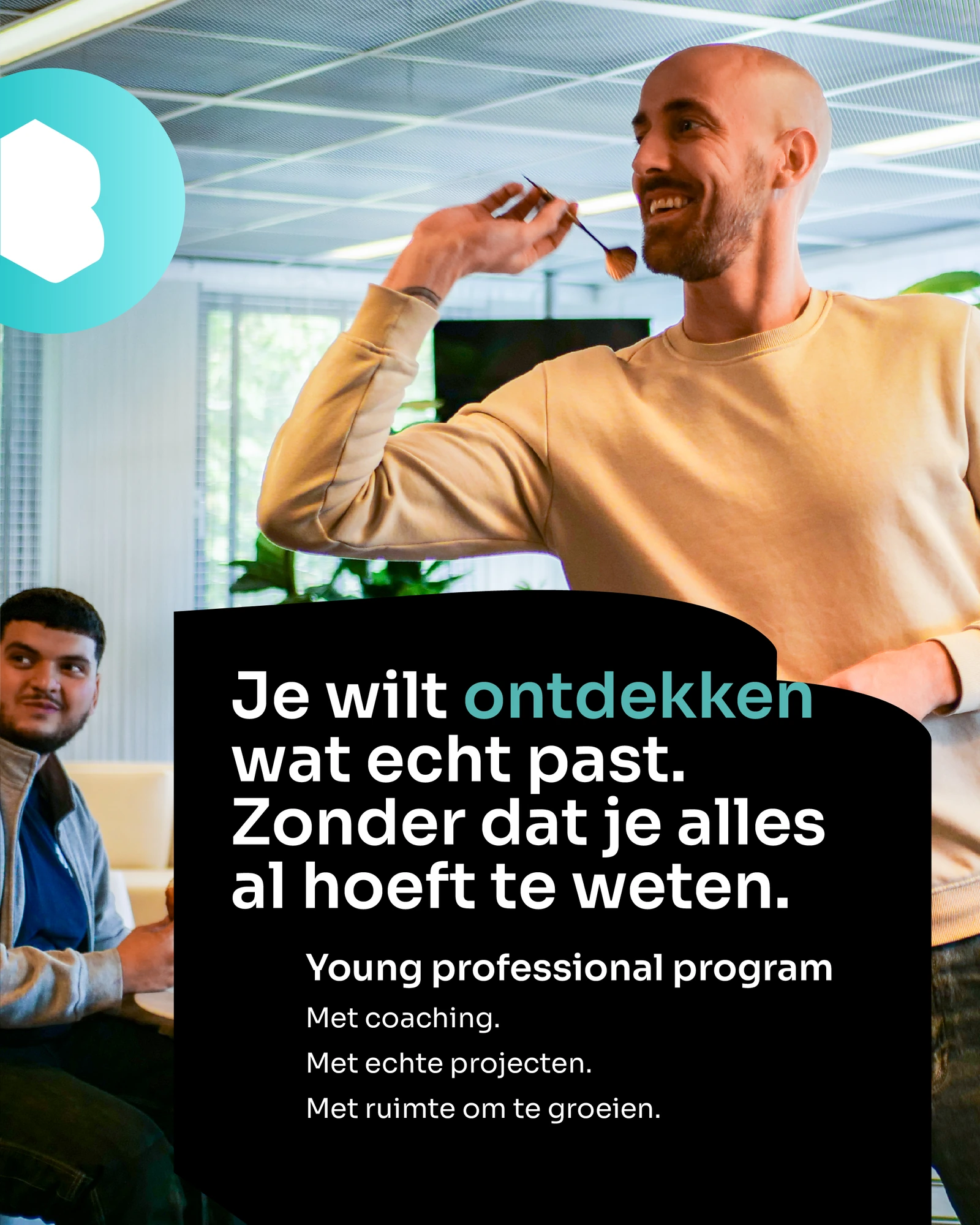
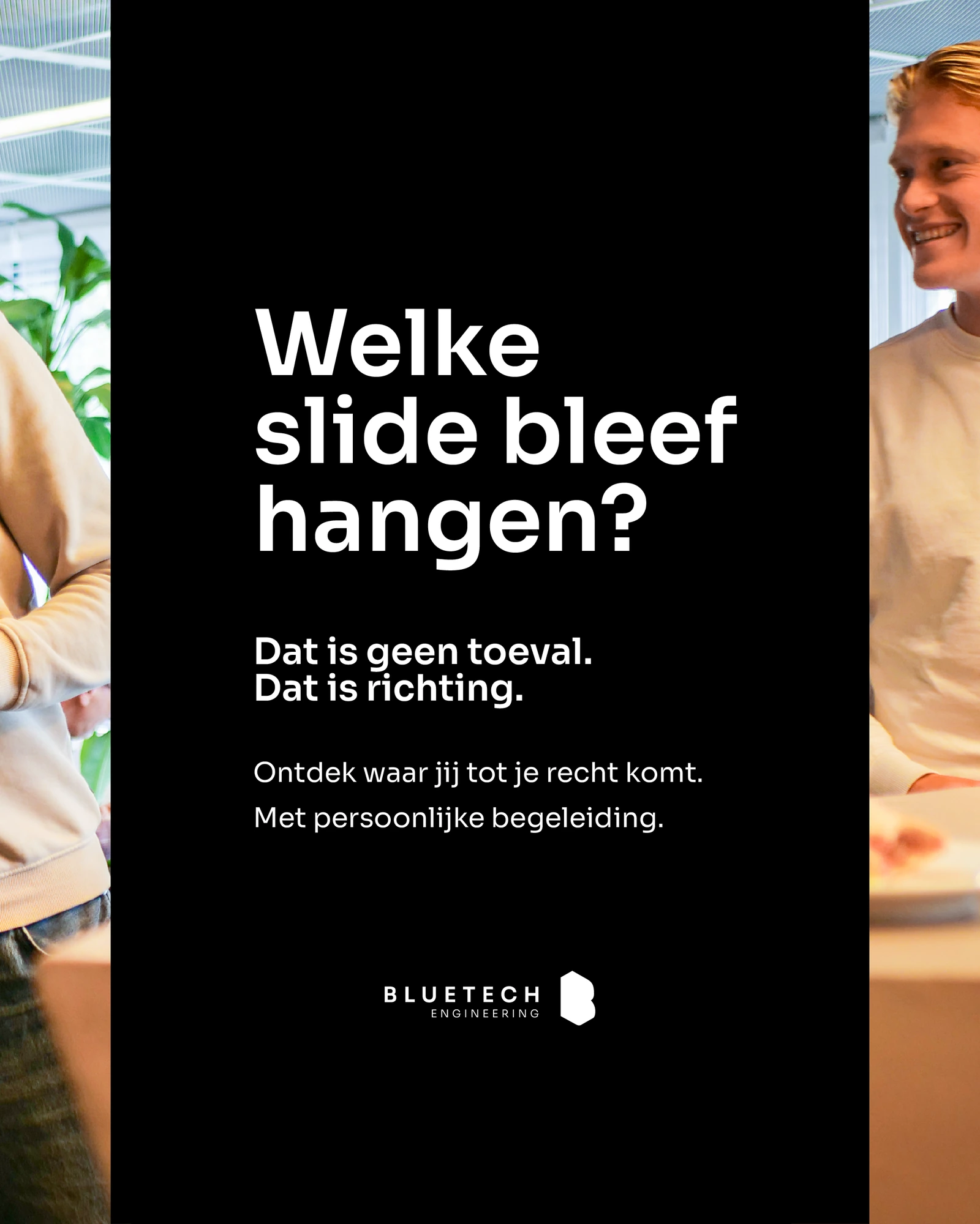
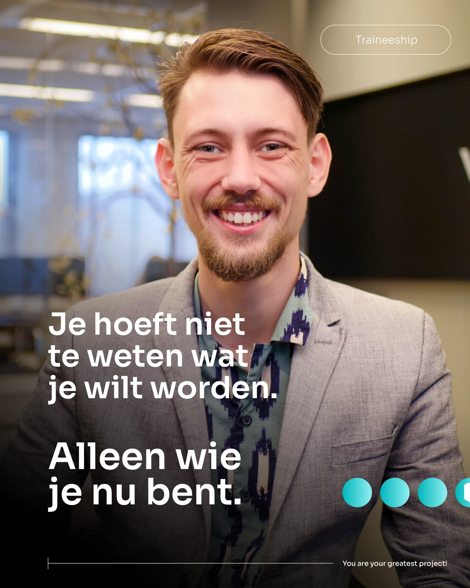
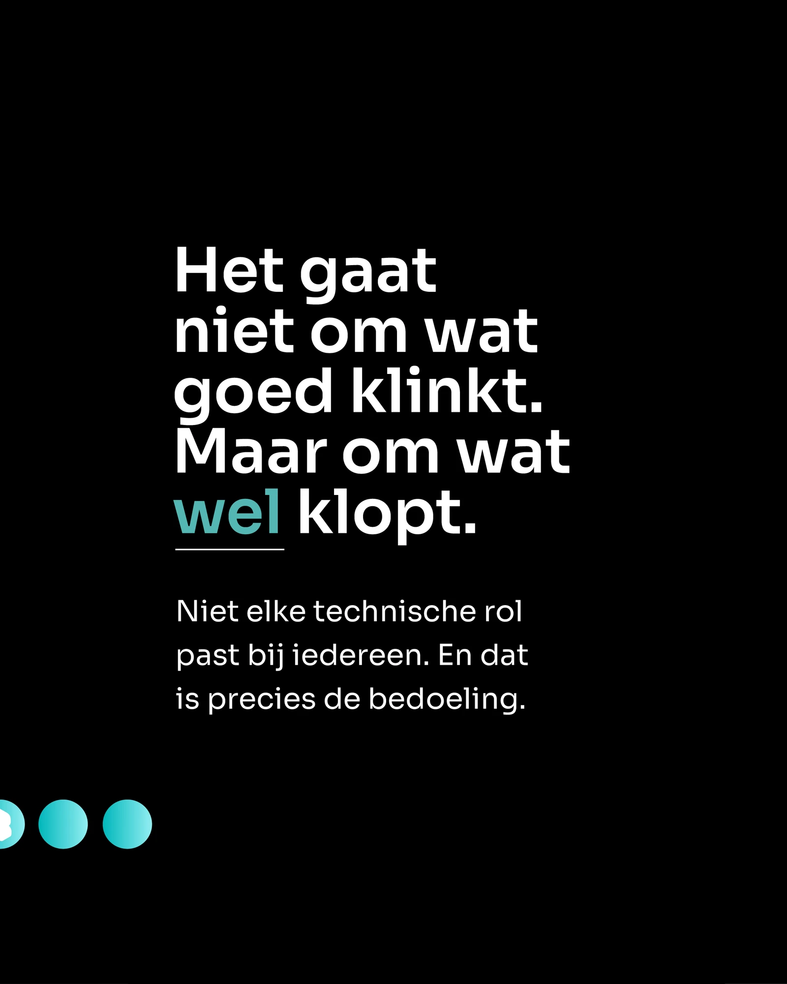
The traineeship visuals show how photography, typography and language work together. The message starts with uncertainty about a career choice: “Niet weten wat je wilt is een prima startpunt.”
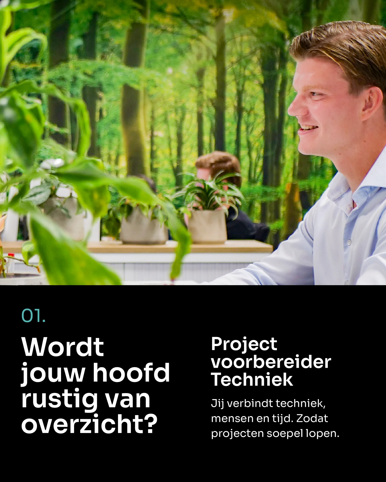
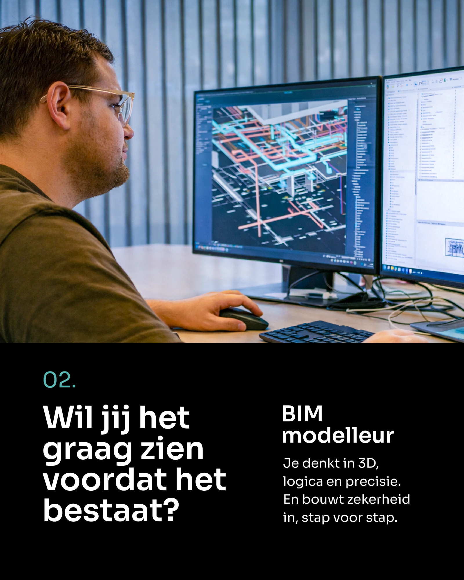
The two carousel sequences below introduce different technical roles within the same identity. Each role has its own message, while the photography, type and brand elements connect the series.
Photography-led traineeship communication.The same message in a typographic application.
META / CAROUSEL 01
Finding a technical direction.
1 / 10
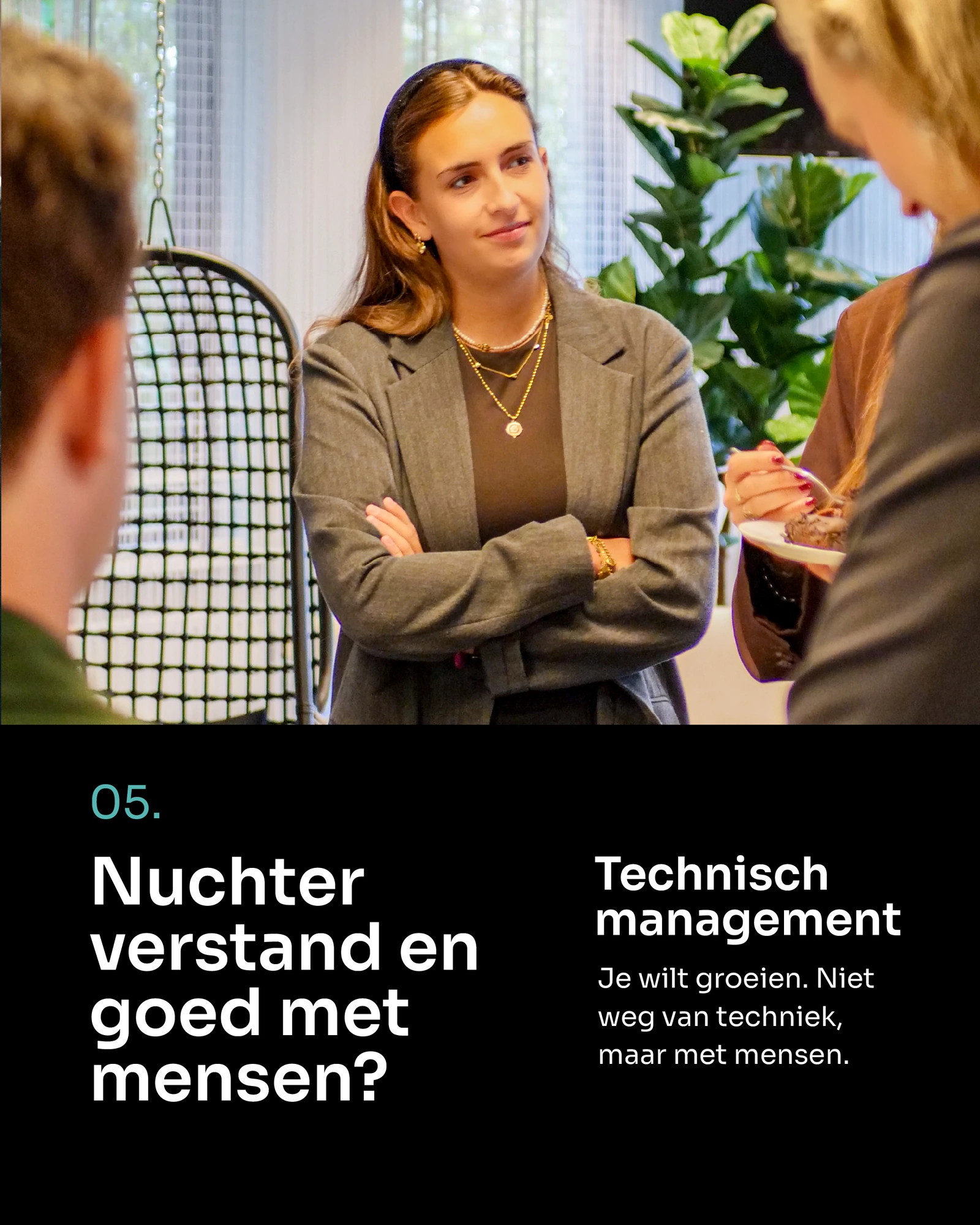
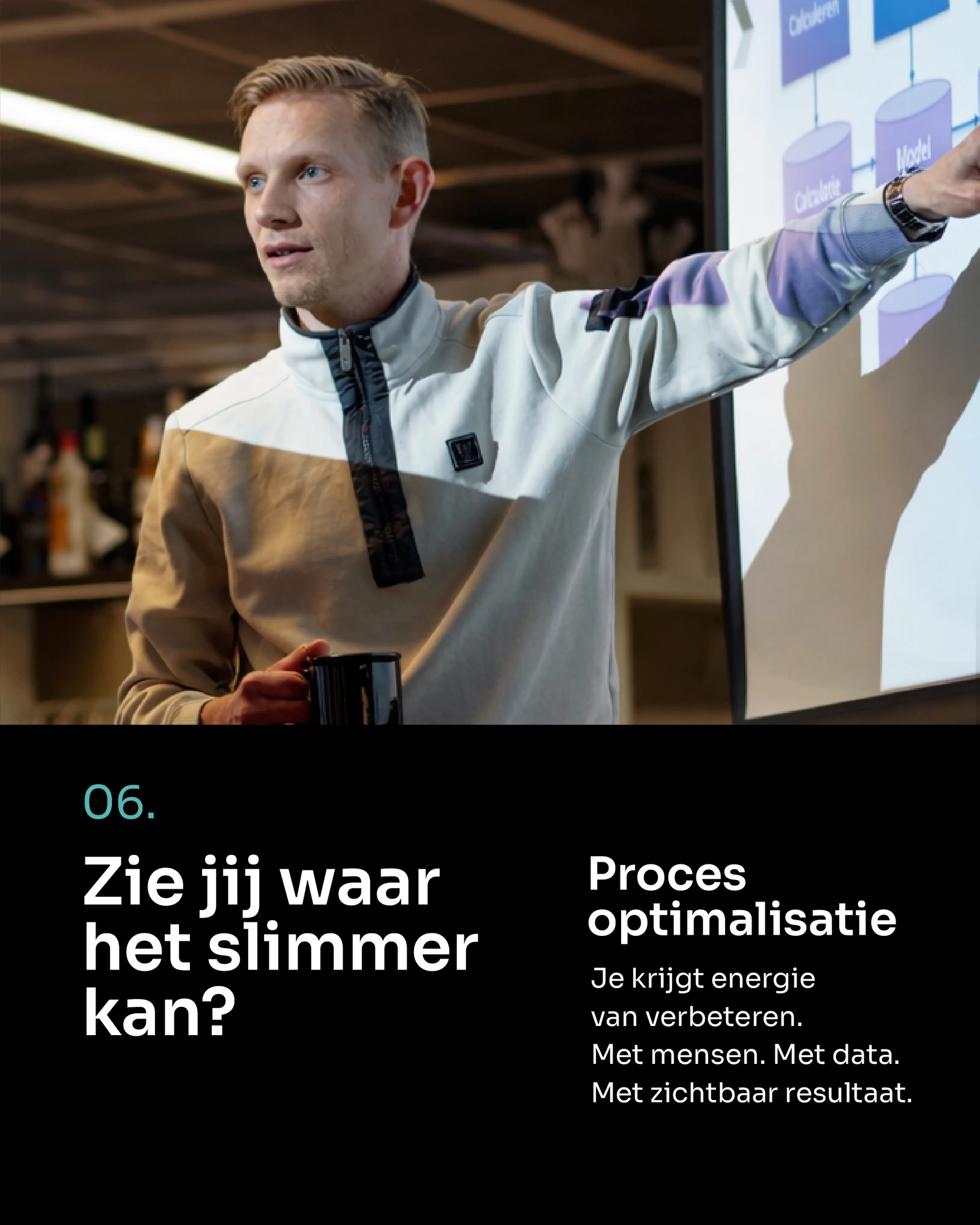
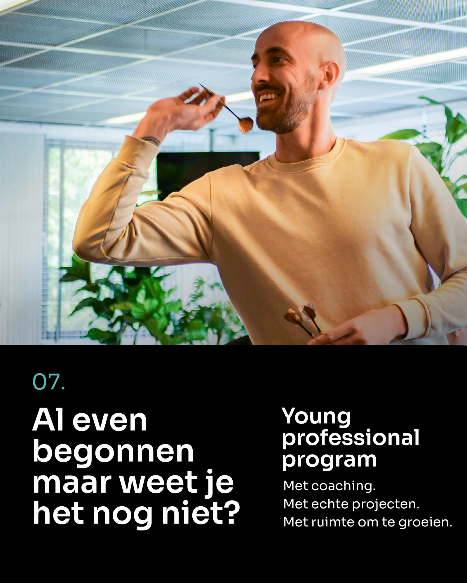
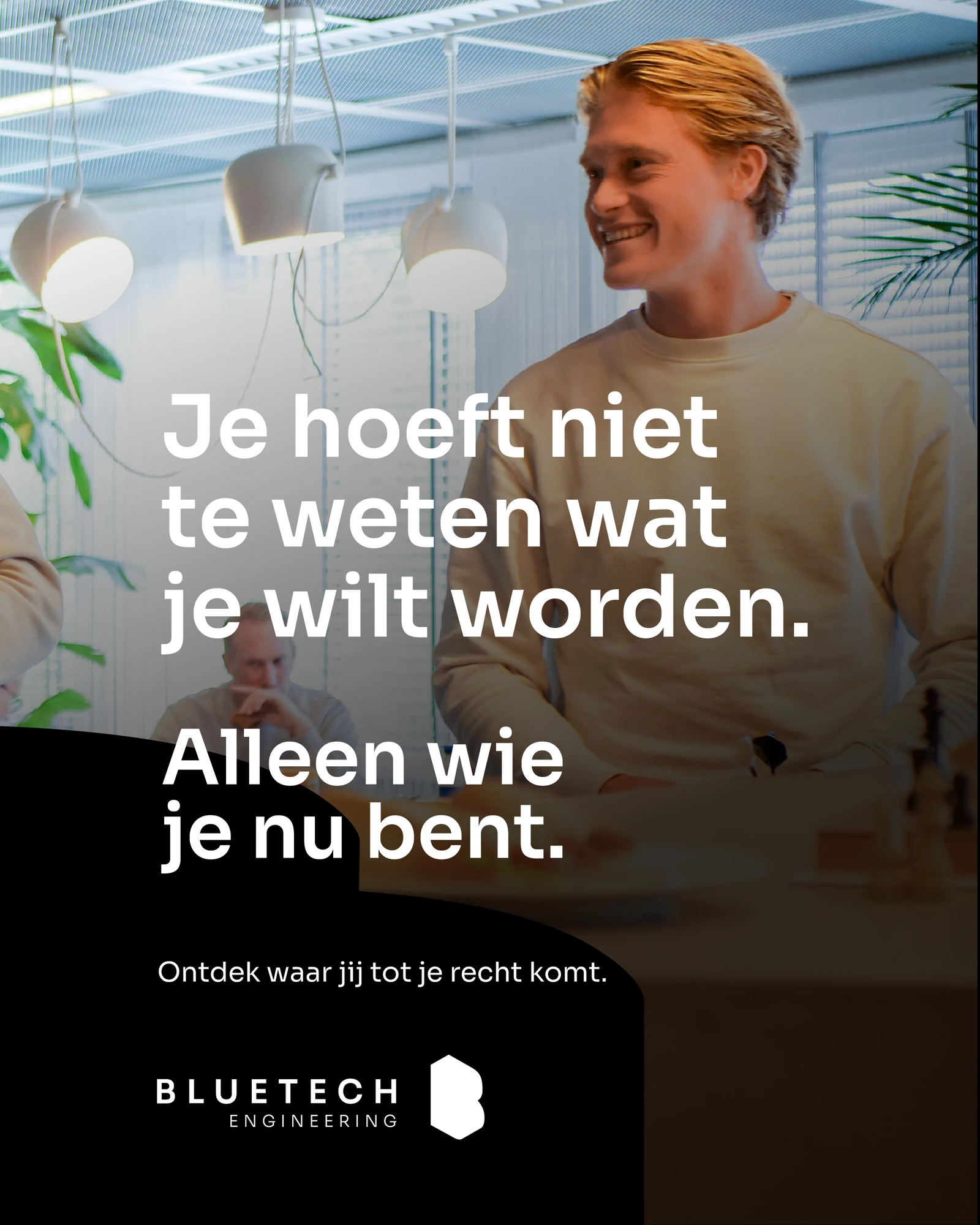
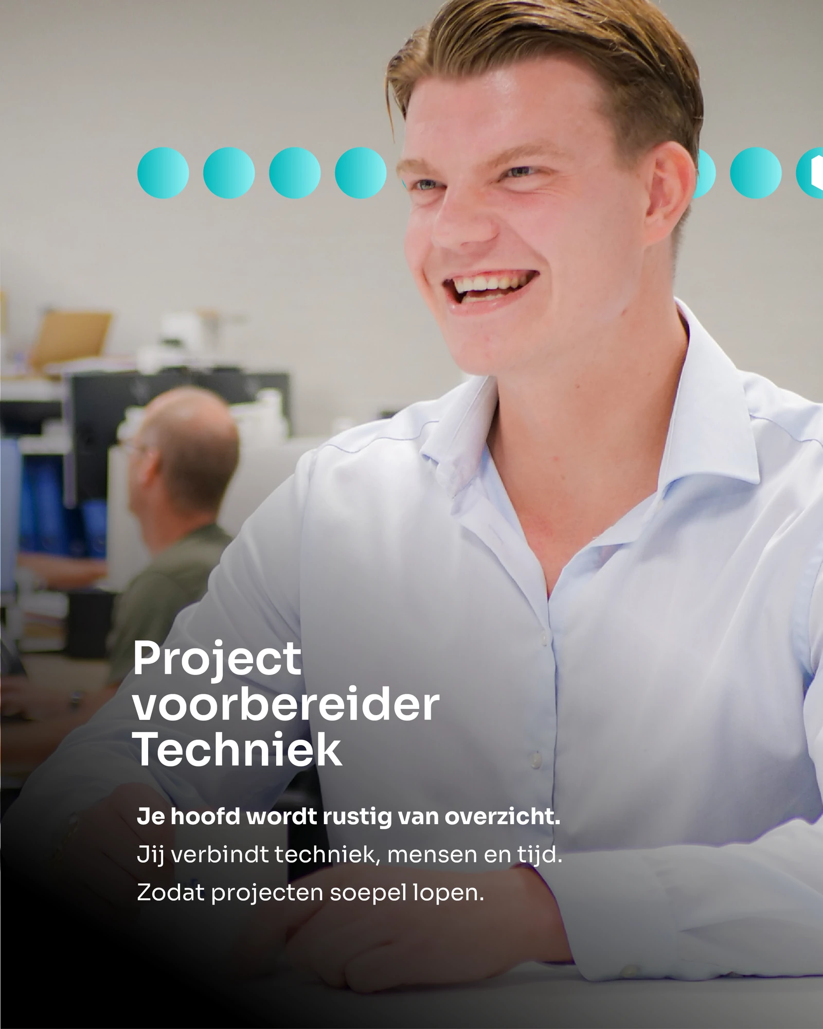
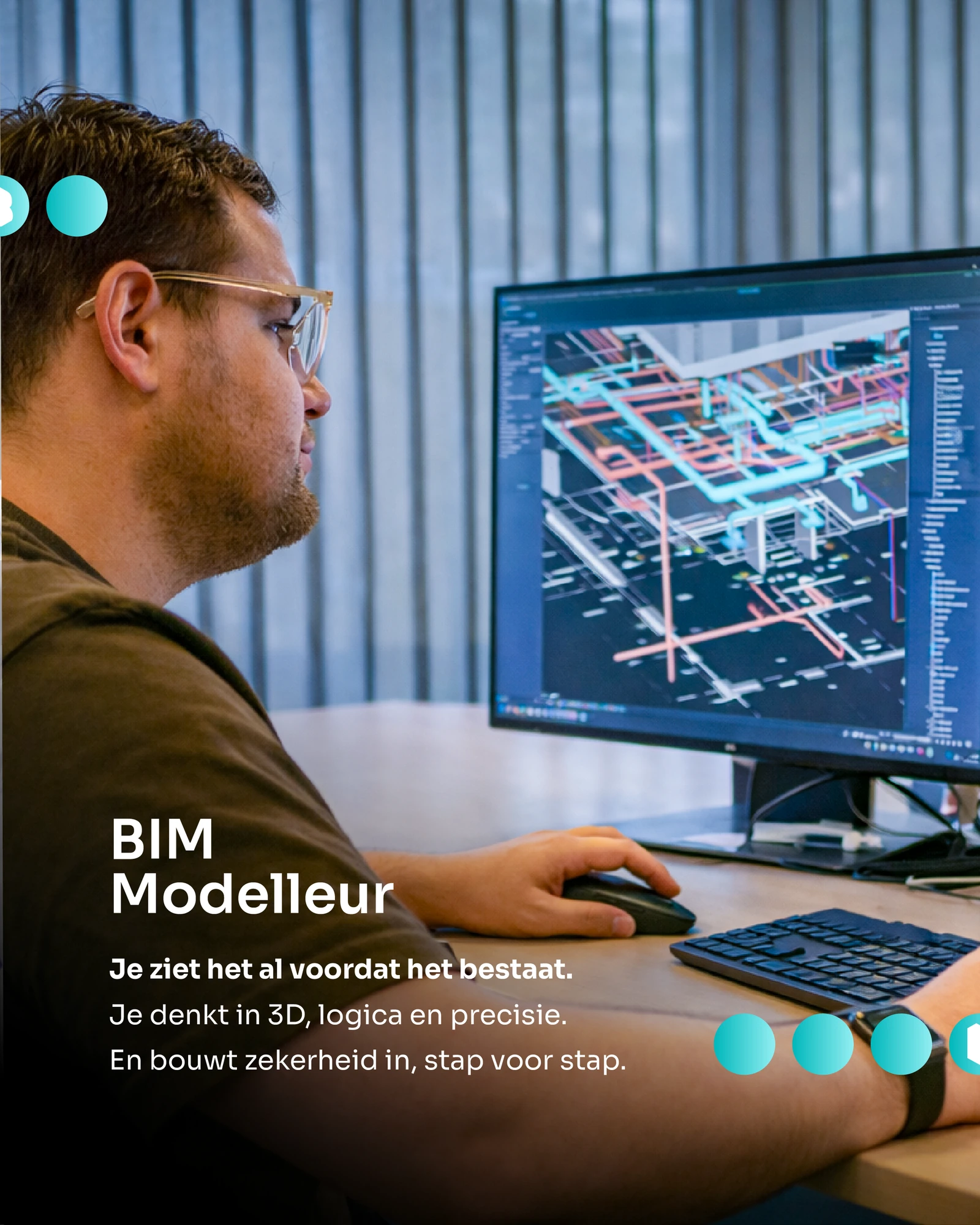
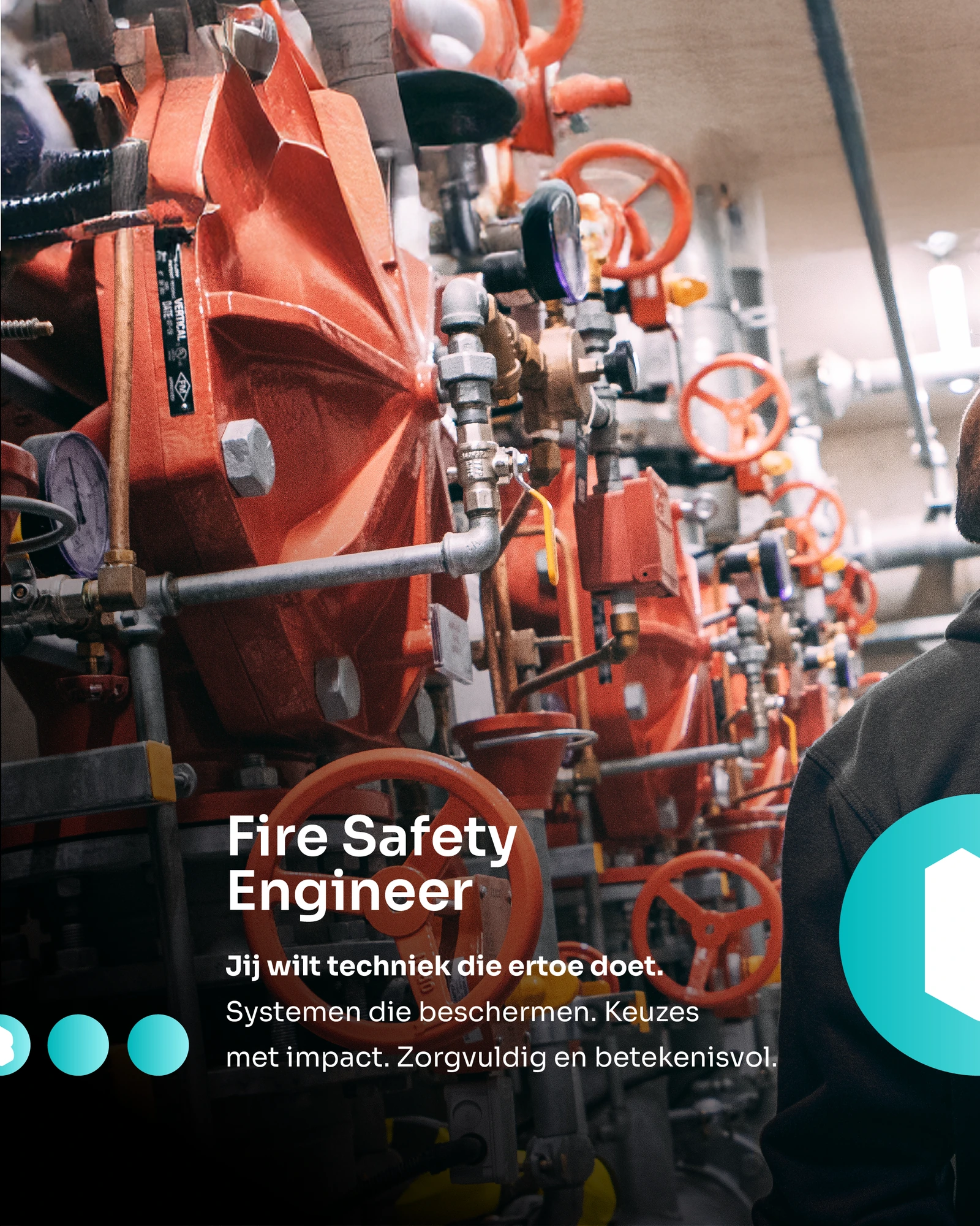
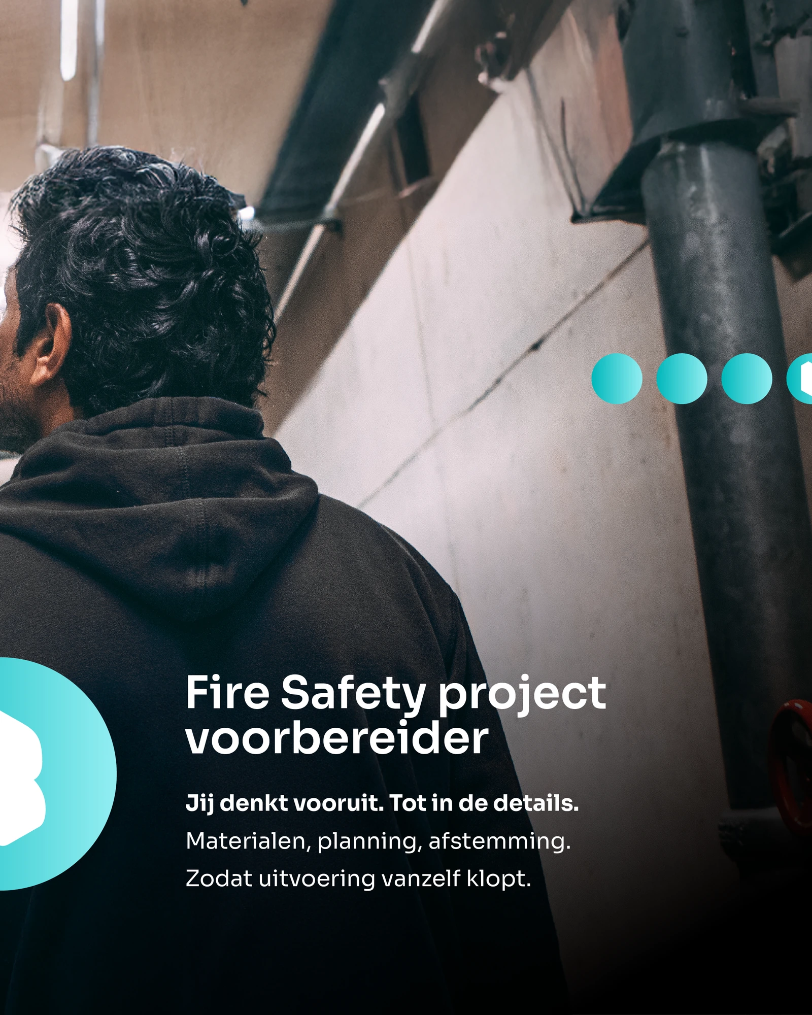
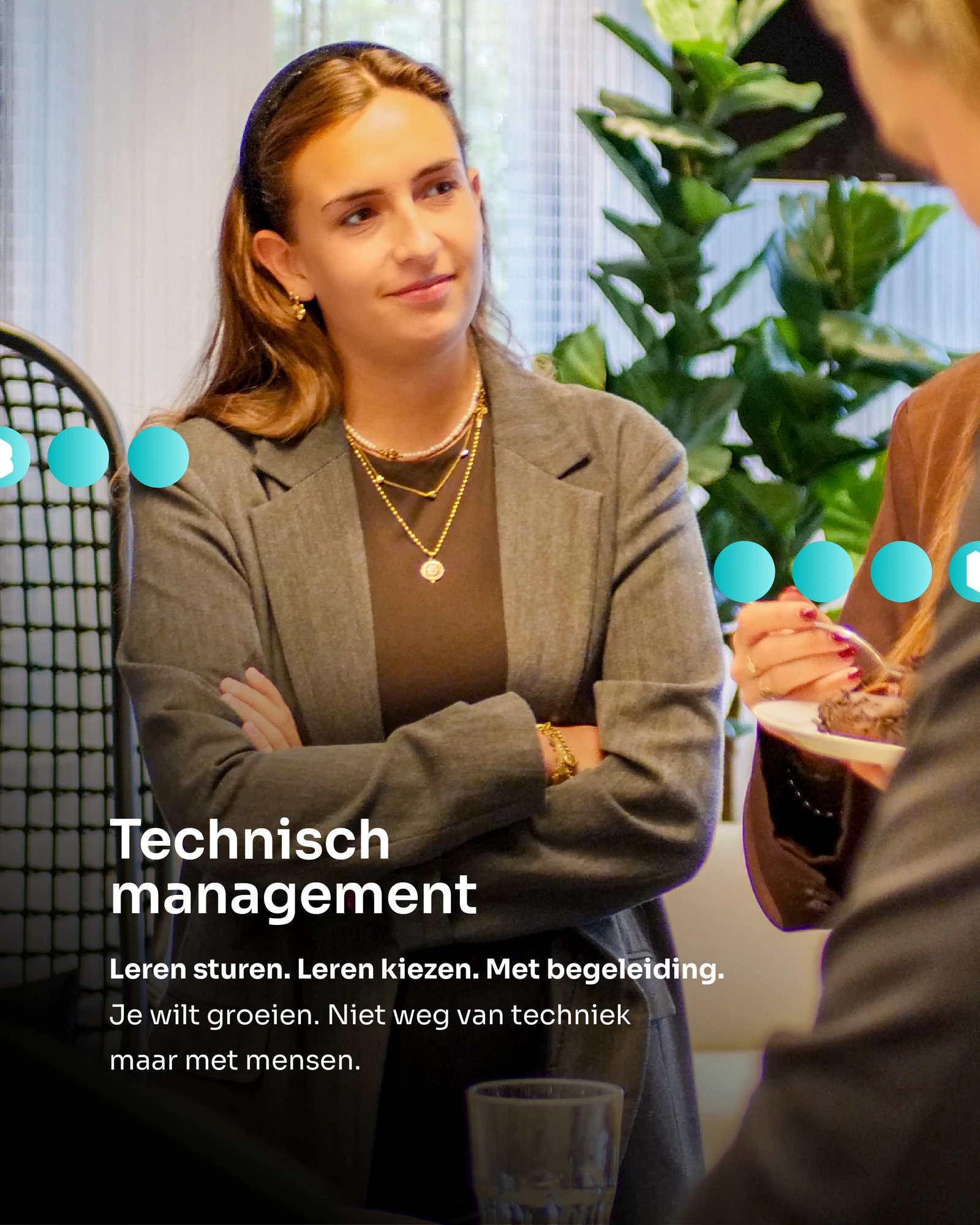
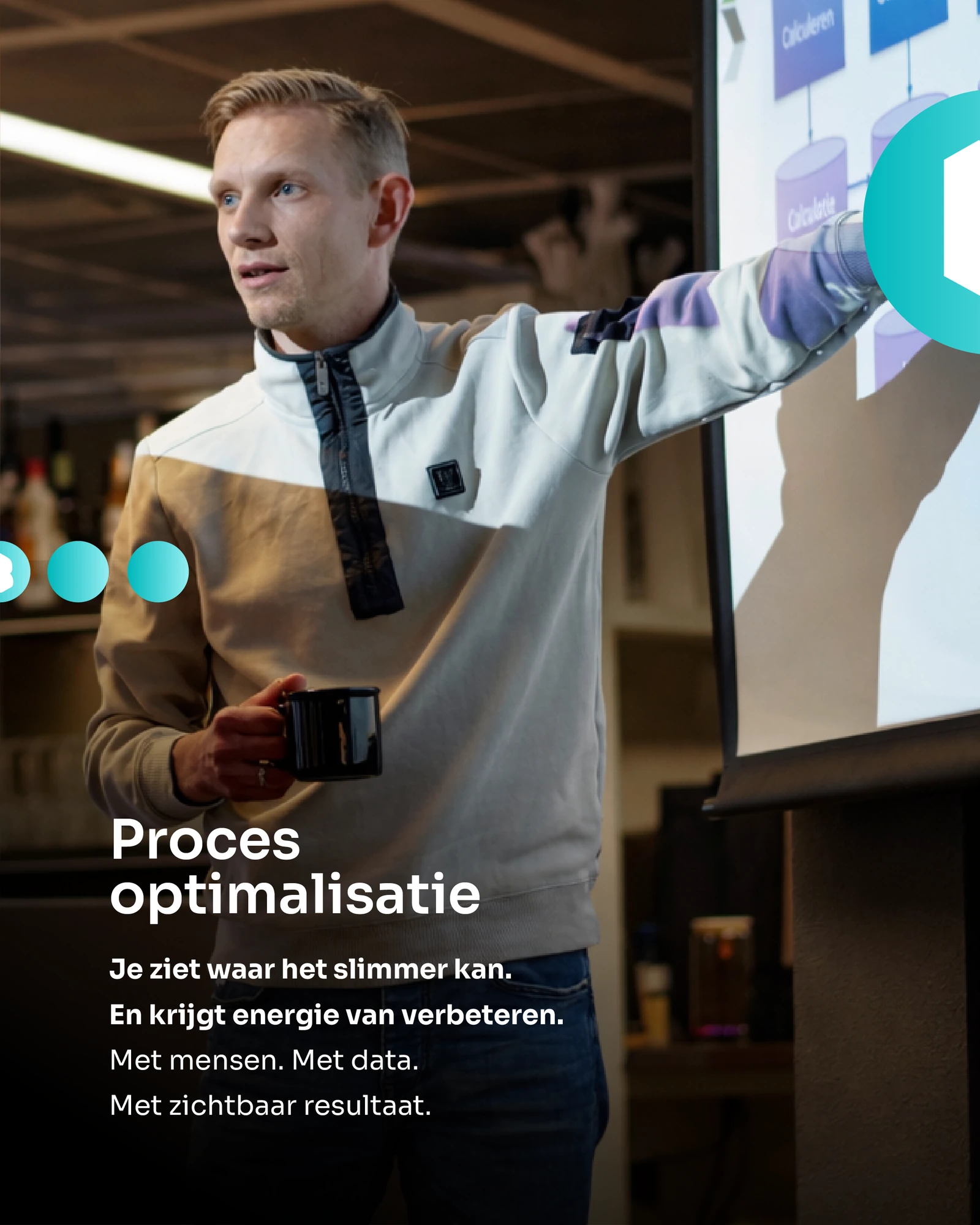
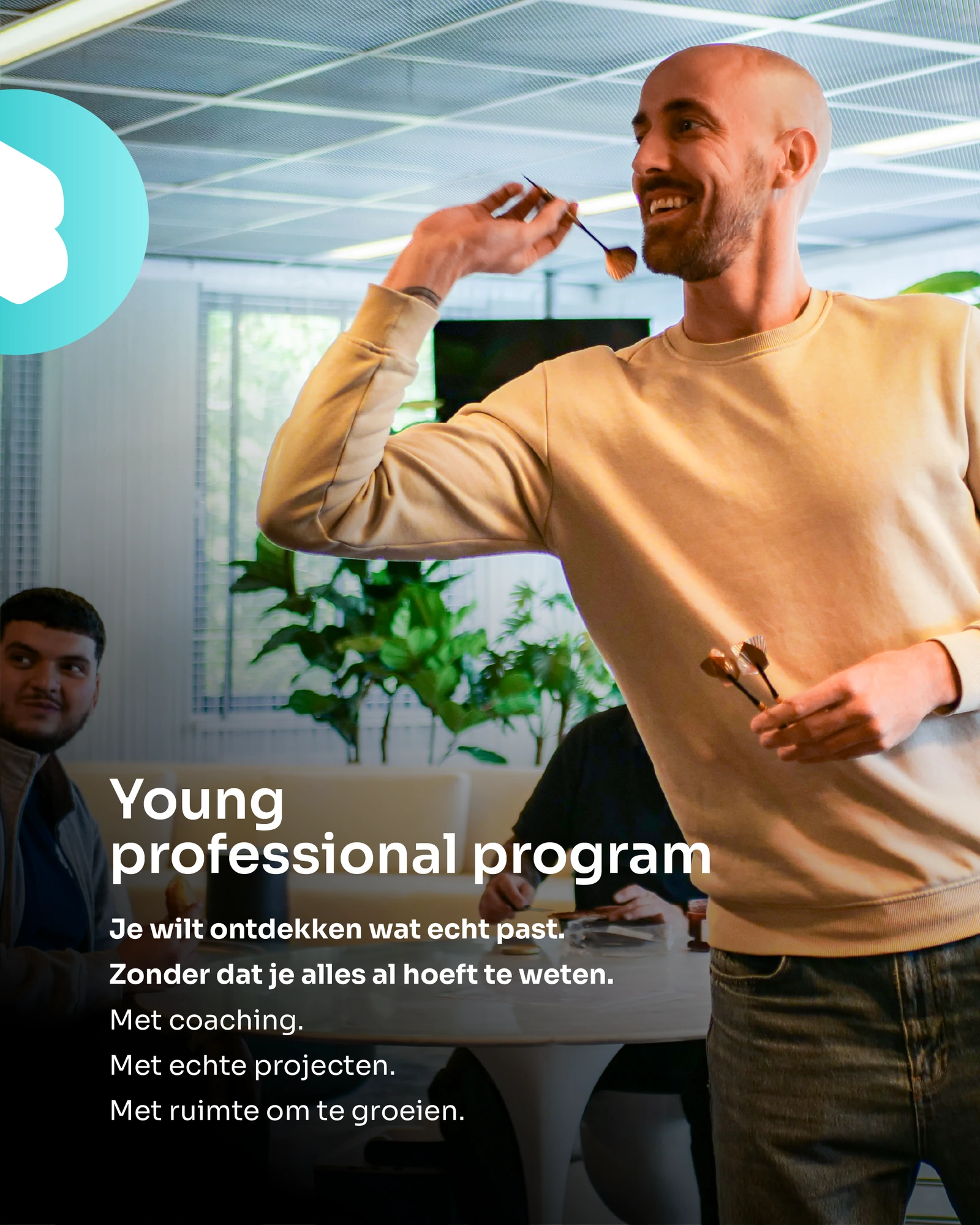
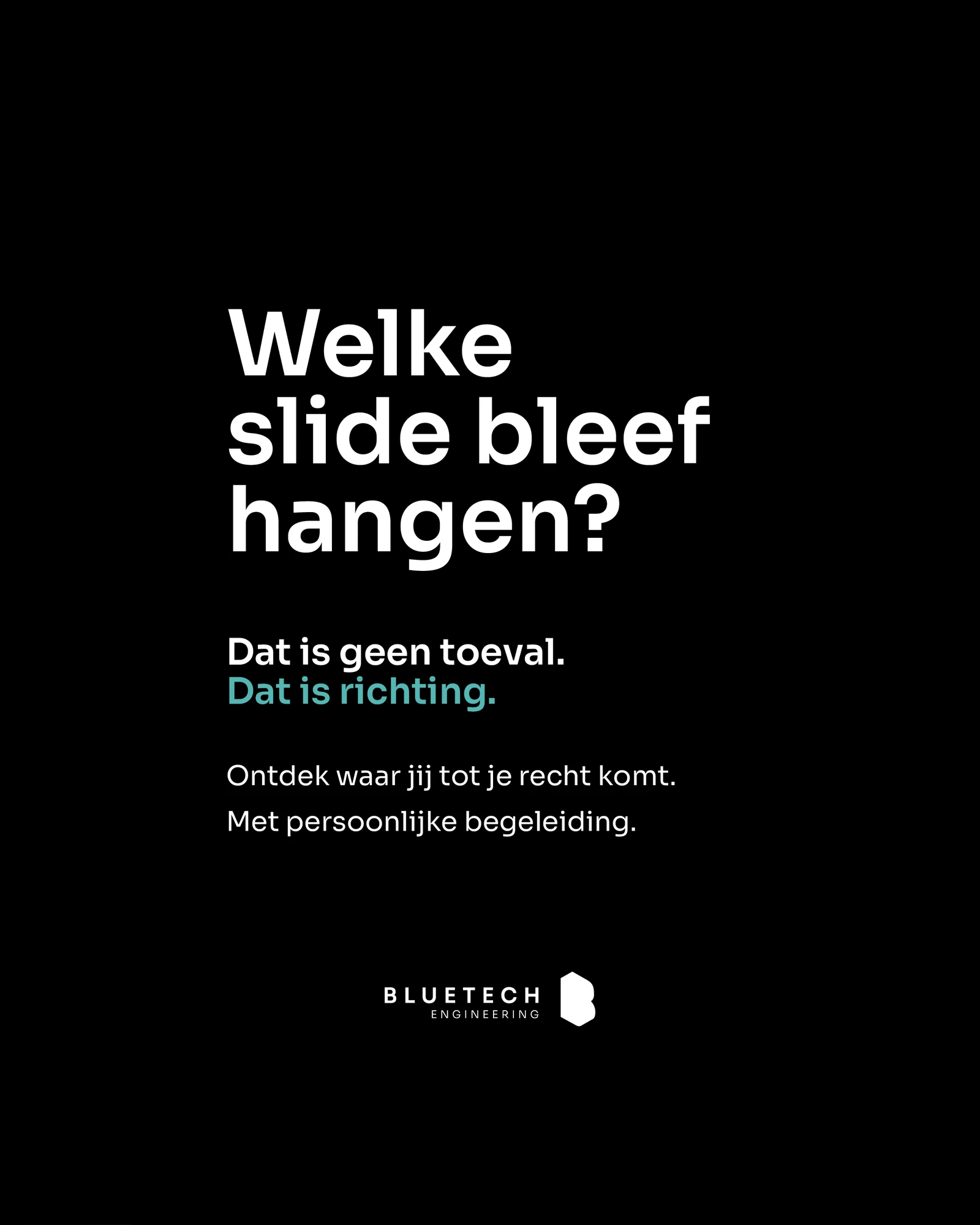
01 / Opening: not knowing what you want is a good starting point02 / Project preparation: creating calm and clarity03 / BIM modelling: seeing it before it exists04 / Fire safety: engineering and project preparation05 / Technical management: clear thinking and people06 / Process optimisation: making work smarter07 / Young professional programme: taking the next step08 / Discover where you belong09 / Discover what really fits10 / Closing: which slide stayed with you?
Swipe or use the arrows to explore all 10 slides. Select an image to enlarge it.
META / CAROUSEL 02
Start with who you are.
1 / 10
01 / Opening: who you are, before what you want to become02 / Finding what really fits03 / Project preparation04 / BIM modelling05 / Fire safety engineering06 / Fire safety project preparation07 / Technical management08 / Process optimisation09 / Young professional programme10 / Closing: which slide stayed with you?
Swipe or use the arrows to explore all 10 slides. Select an image to enlarge it.
03 / SUB-BRANDS
Room for their own character.
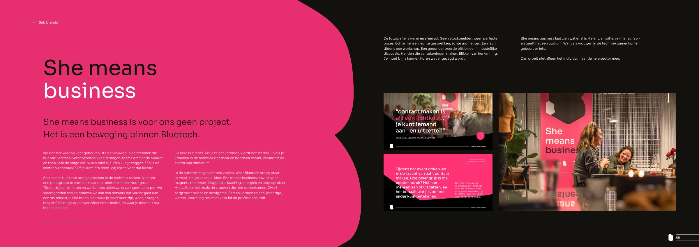
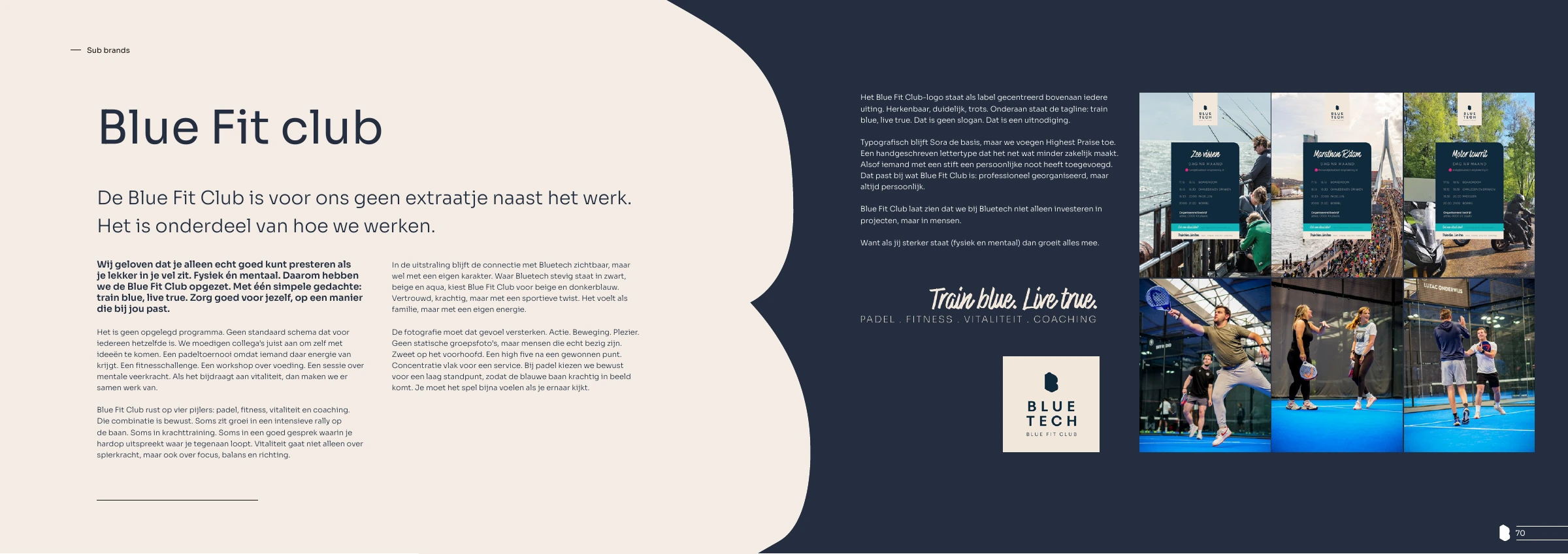
I developed the branding for She Means Business and Bluefit Club within the wider Bluetech identity. Each needed room for its own character, with the connection to the parent brand clearly visible.
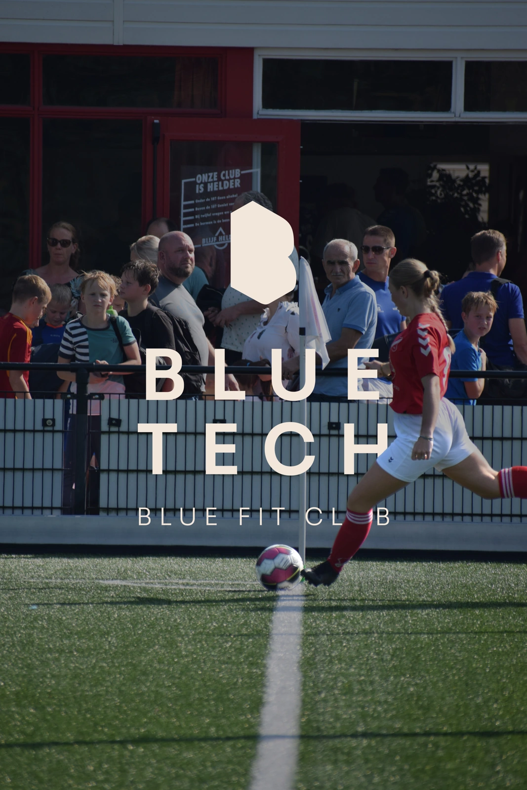
The brandbook spreads show the two directions. The football visual shows Bluefit Club applied to sports communication.
She Means Business: a distinct expression within the Bluetech brand.Bluefit Club: guidelines for the sports and wellbeing sub-brand.
Bluefit Club applied to a football visual.
04 / TRAINEESHIPS
One family. Different futures.
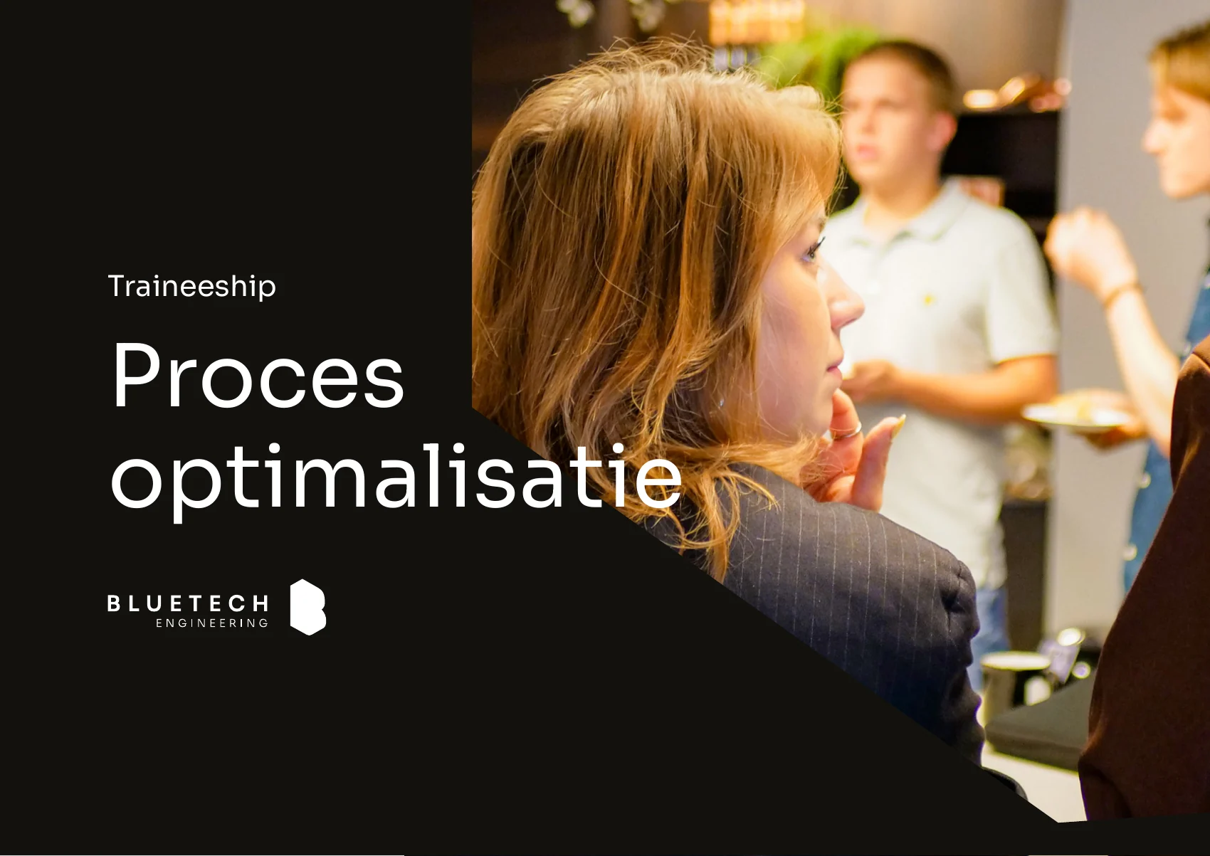
I developed a series of brochures for all traineeships. Each programme has its own content within a shared brand language.
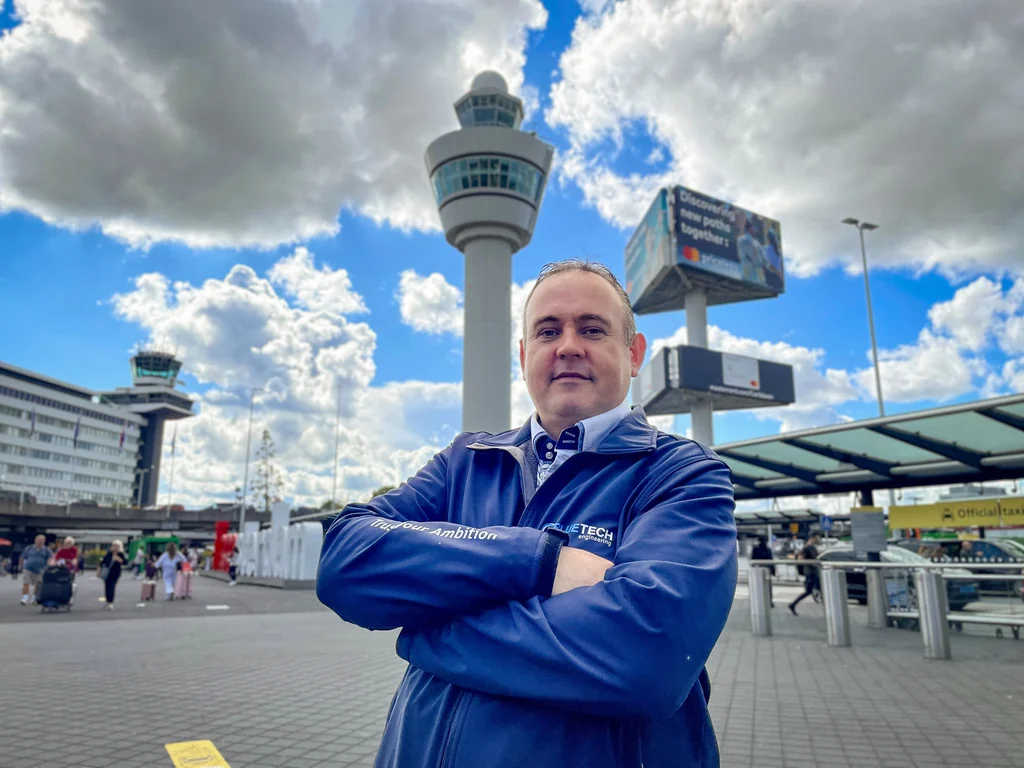
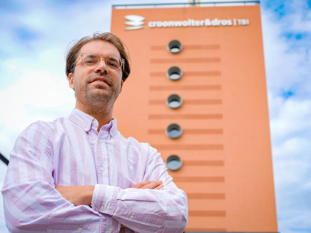
I conduct interviews with professionals, trainees and clients and turn their experiences into written stories. Selected interviews also form the basis for video productions.
06 / VIDEO
A story worth watching.
A selection of short-form and landscape videos, alongside the written interviews and visual design work.
07 / COMMUNITY
A home for the community.
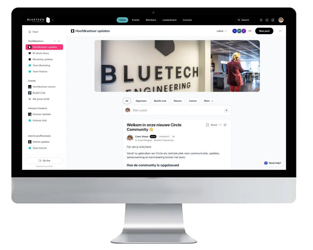
I selected Circle for its branding control and lead its implementation as the home for community news, groups and events.
The choice also addressed practical barriers in the alternatives we evaluated. Viva Engage did not support joining with personal email addresses, while WhatsApp did not provide the event functionality we needed. Some participants also preferred not to share their mobile number. Circle brought these requirements together in a community that could carry the Bluetech identity.
Circle: a shared home for news, groups and events.
“Hij denkt strategisch mee en is een continue ideeënmachine, zelfs als het hele team even vast lijkt te zitten.”Eva Slot · Interim Marketing Manager, Bluetech Engineering LinkedIn recommendation, excerpt