Turning a complex product portfolio into clear communication, practical documents and a website that teams could maintain.
01 / ORIGINAL IDENTITY
The orange identity.
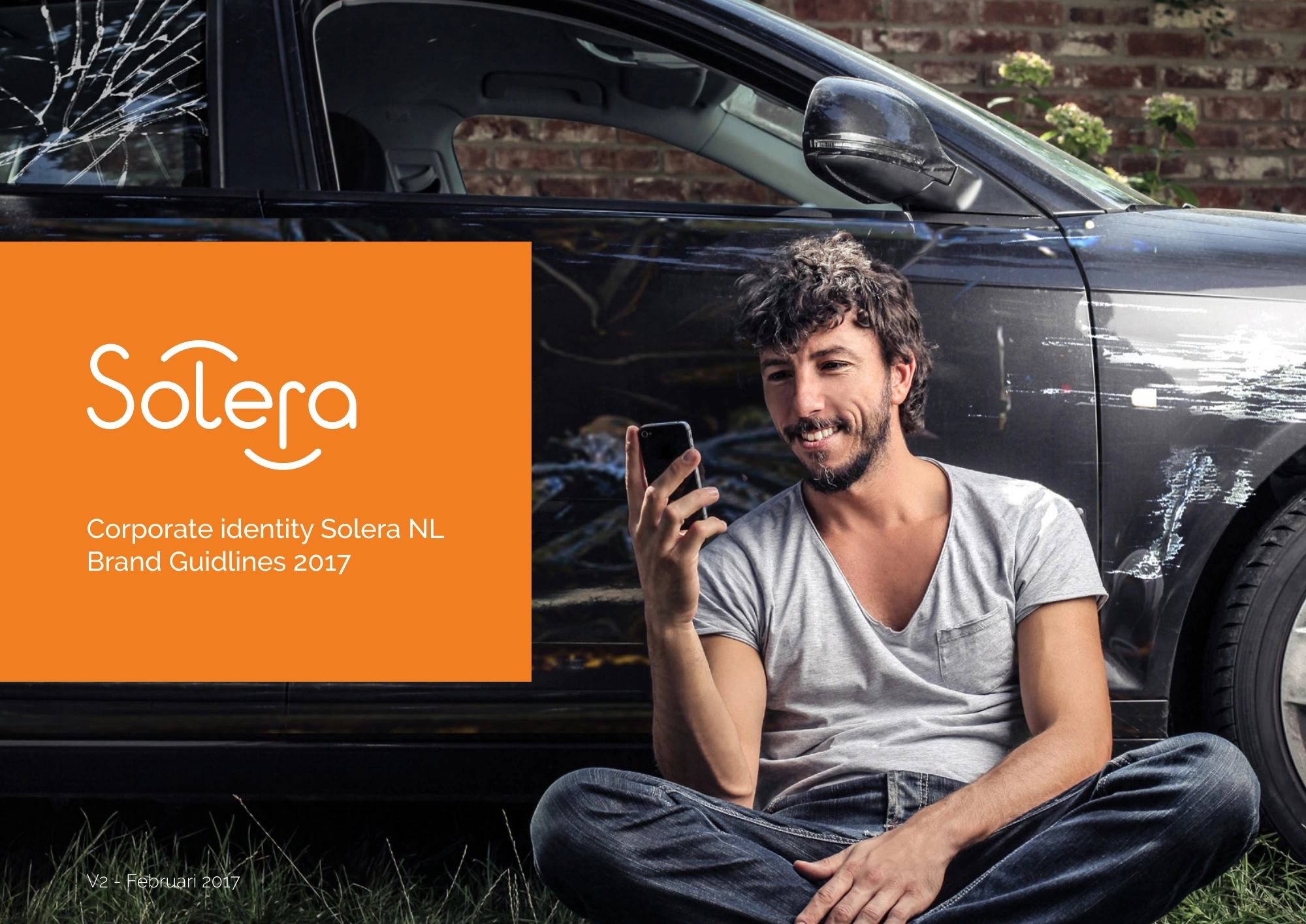
Solera Netherlands / Brand guidelines 2017 The local identity, its applications and earlier product work.
Solera Netherlands brand guidelines, 2017. The image expresses reassurance: even with a damaged car, you can still smile.
01 / NETHERLANDS BRAND SYSTEM
From core identity to daily use.
The logo, orange and typography were established. I developed the remaining visual elements for the Netherlands brandbook, including a system for subsidiary brands and their colour palettes.
I developed the design work in direct consultation with the Product Development Manager, Managing Director and Sales Manager.
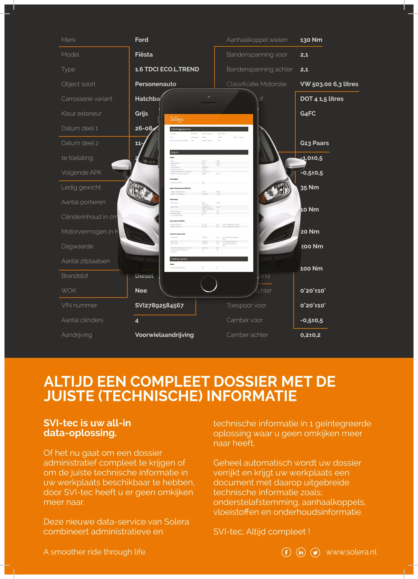
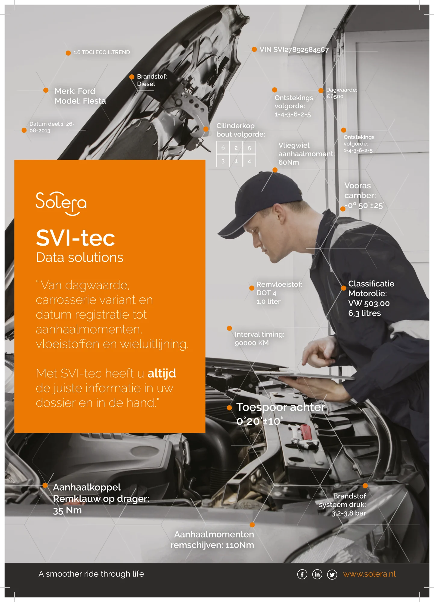
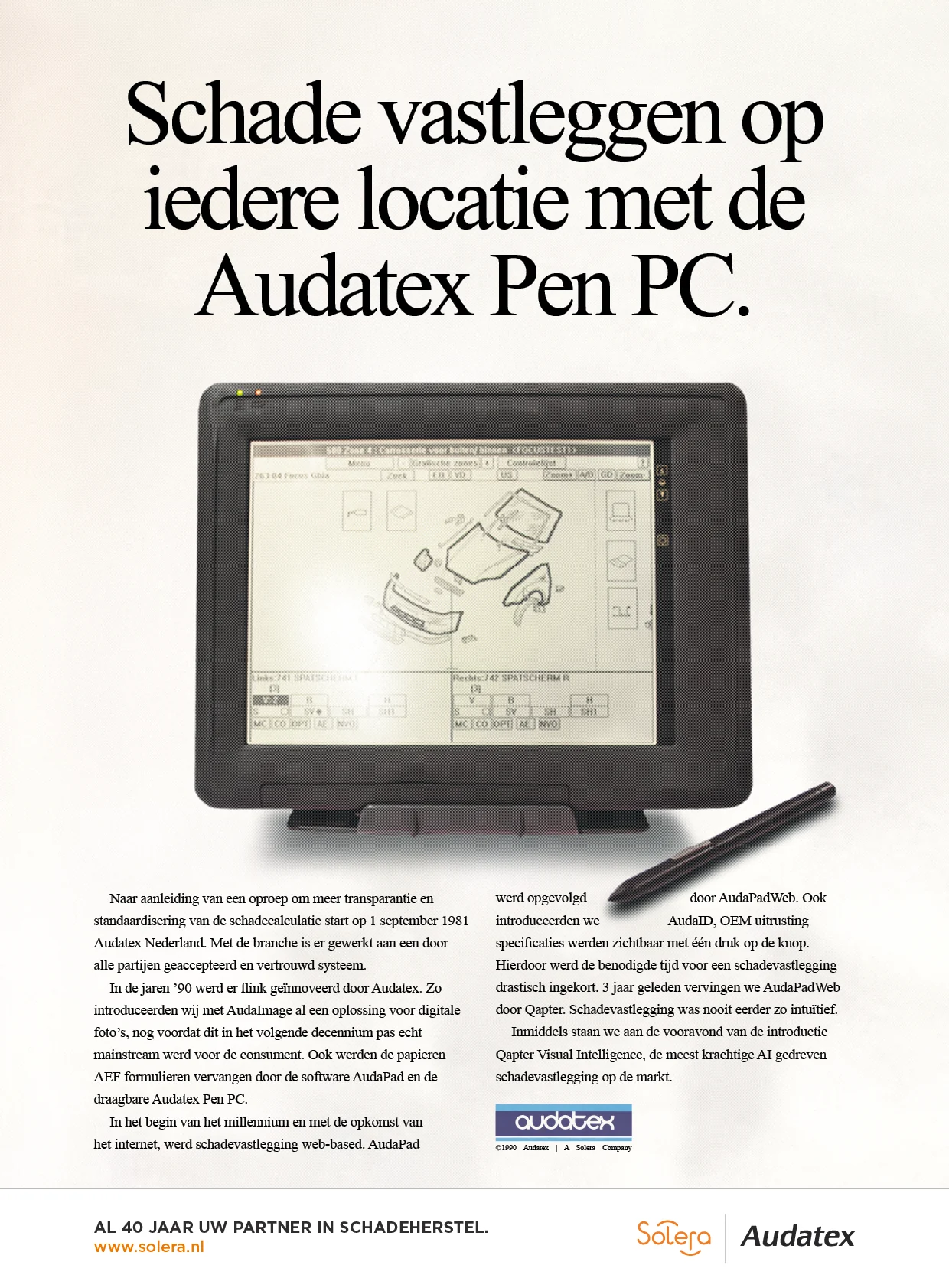
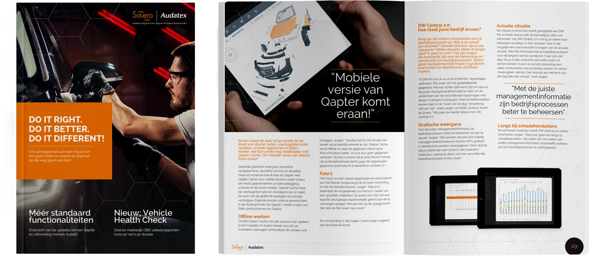
SVI-tec campaign.Product communication.40 years of Audatex.
Audatex magazine: editorial design in a consistent brand language.
02 / EVENTS — ORIGINAL IDENTITY
Bring the brand into the room.
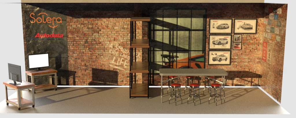
I translated the orange Netherlands identity into a workshop-inspired stand design.
Workshop-inspired stand design.
03 / PRODUCT & UI — EARLIER WORK
Branding that works on screen.
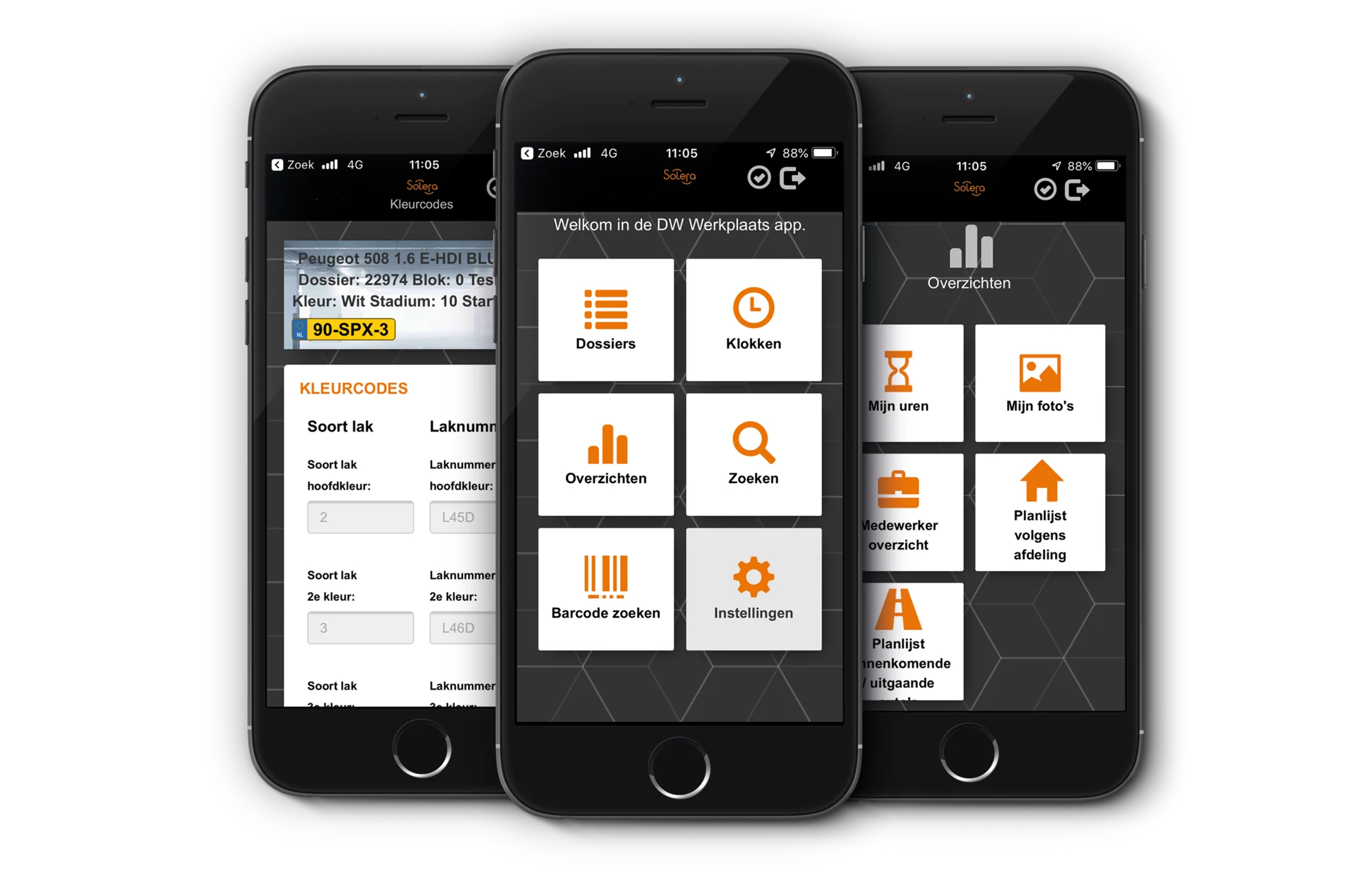
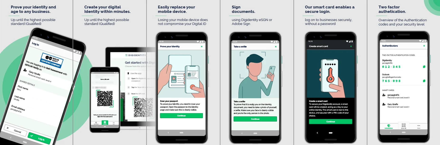
I applied the product identities to the existing UX of VHC360, De Werkplaats App and the Digidentity app, and advised on workflows. I also reviewed the UX of the Reception App.
As Digidentity’s lead designer within Solera, I translated its brand identity into digital applications, including the app shown here.
De Werkplaats App: brand implementation on an existing UX.Digidentity: lead design from my role at Solera, applying the brand to the existing UX.
04 / VIDEO — EARLIER WORK
Stories in motion.
I produced videos independently and worked on collaborative productions, spanning customer interviews, internal promotion, events and product demonstrations.
02 / GLOBAL REBRAND · FROM 2022
The purple identity.
Purple became the primary brand colour in the global rebrand. I applied the new identity to communication, customer documents, the website and event applications.
05 / GLOBAL APPLICATIONS
One brand. Many applications.
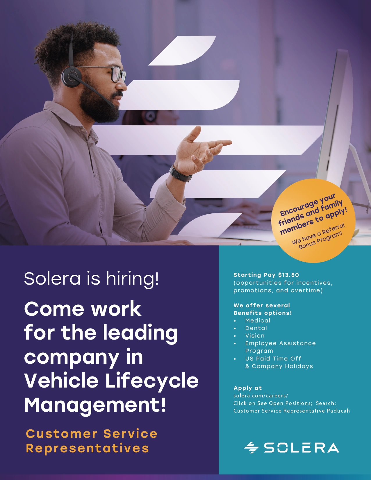
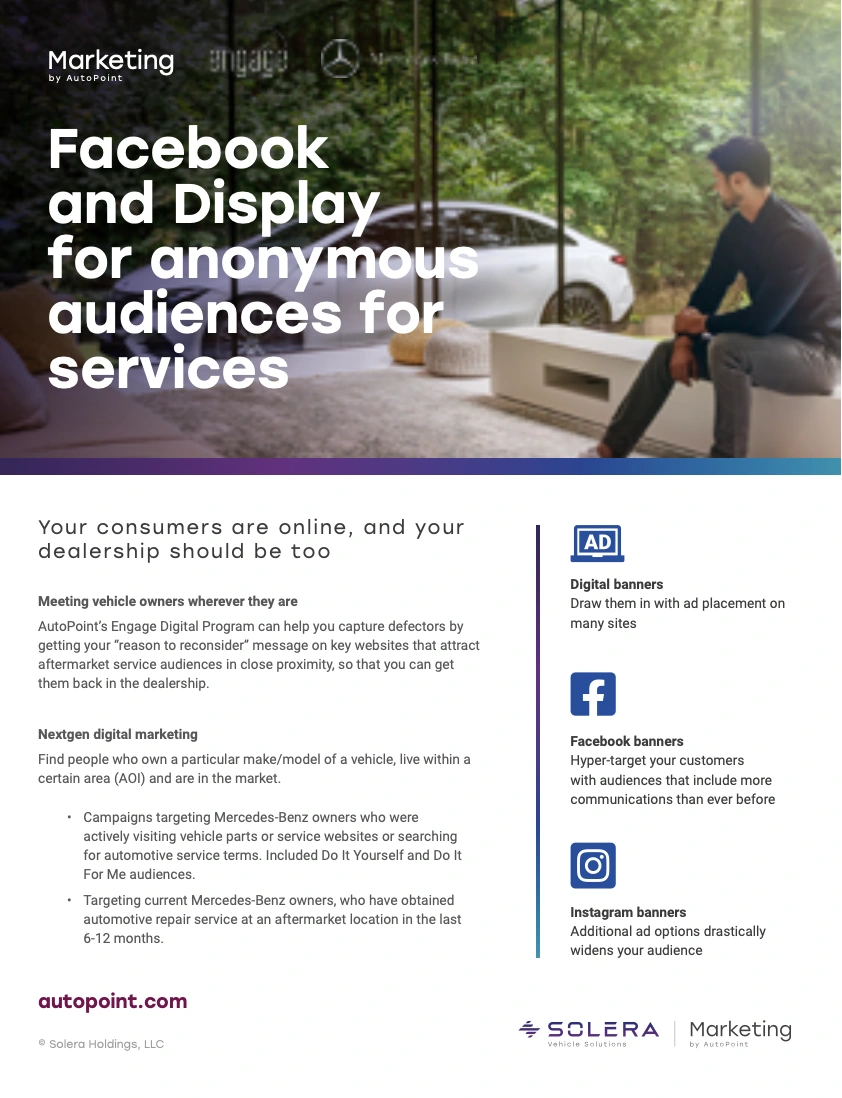
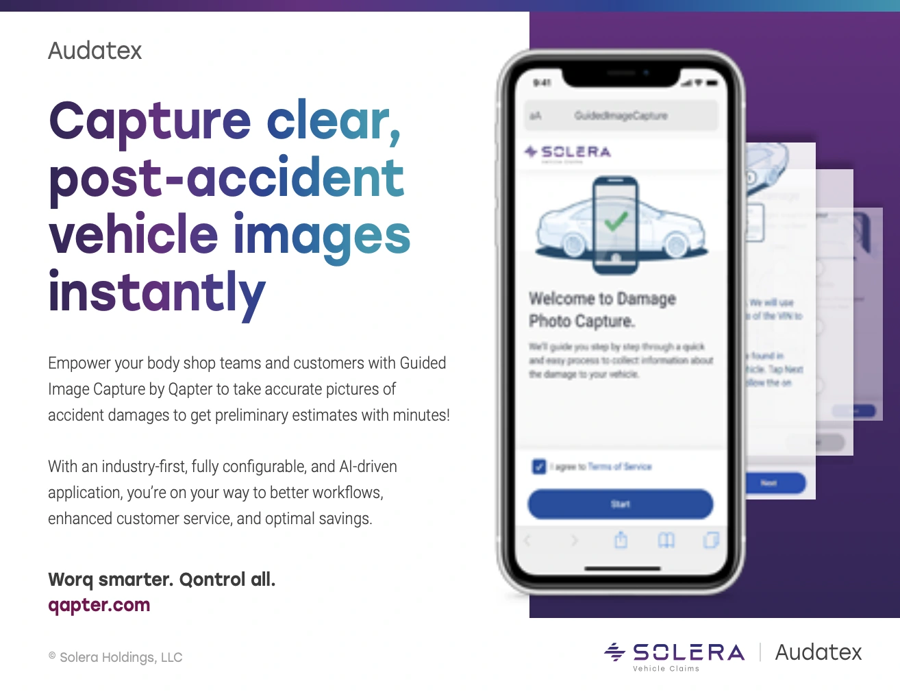
I designed recruitment, automotive service marketing and product communication in the new global identity, applying its typography, imagery and brand elements across different formats.
Recruitment communication: Customer Service Representatives.Service marketing communication for Solera Vehicle Solutions.AutoPoint: digital marketing services within the Solera identity.
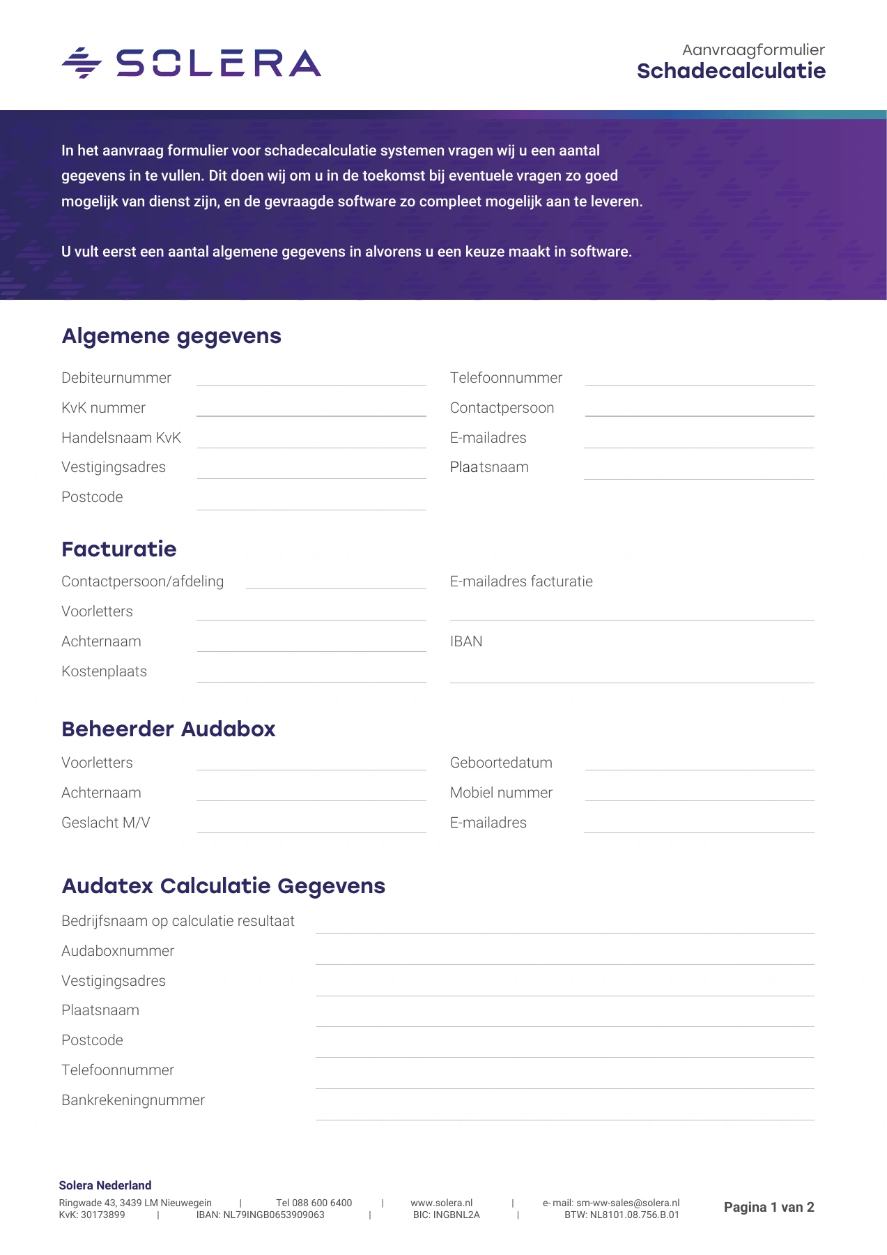
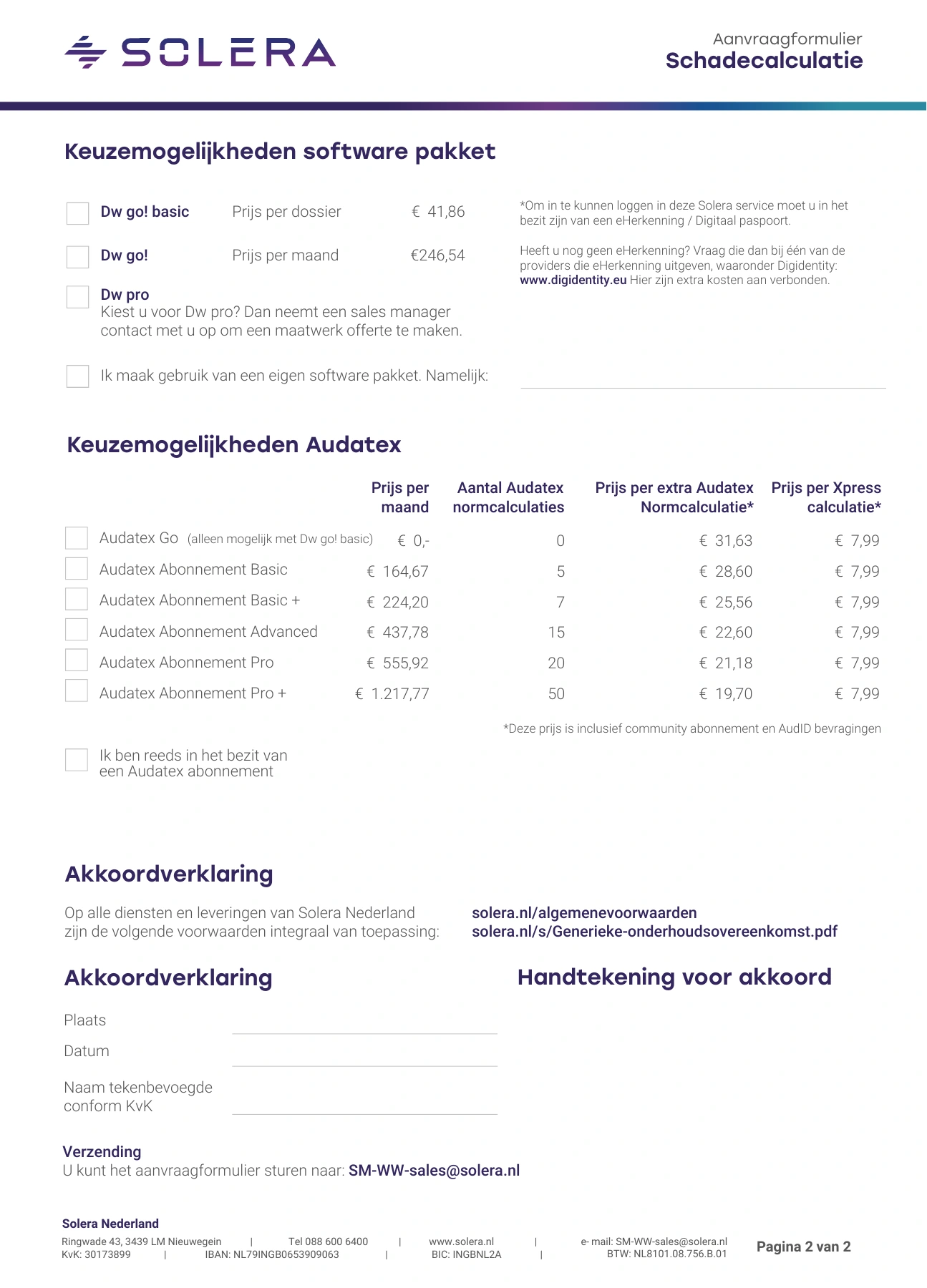
I developed product application forms with clear sections and fillable fields, making it easier for customers to provide the information needed to request Solera products.
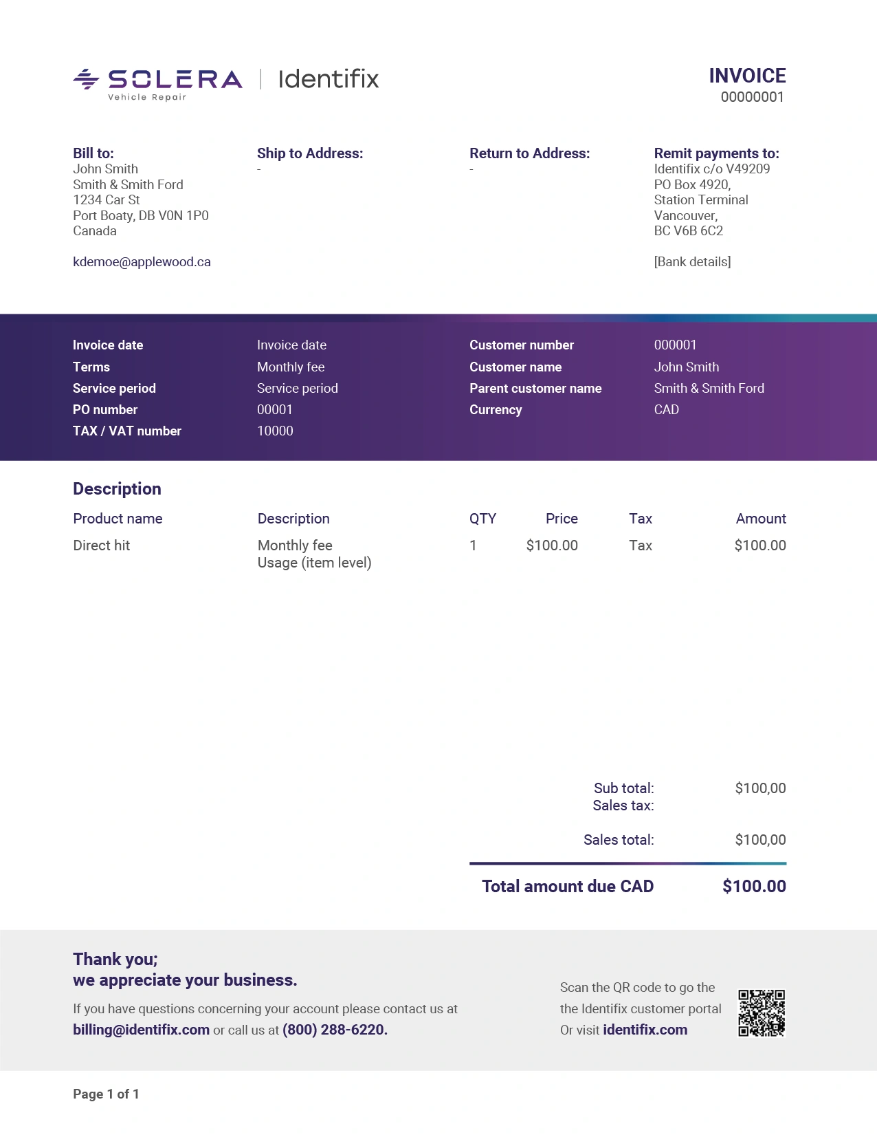
I then extended this work to invoice and quotation design. These layouts needed to support automated document generation, bringing consistent branding and a clear hierarchy to customer, product and payment information.
Product application form: grouped information and fillable fields.Product and subscription choices within the same document structure.Invoice layout designed for automated generation; shown with example content.
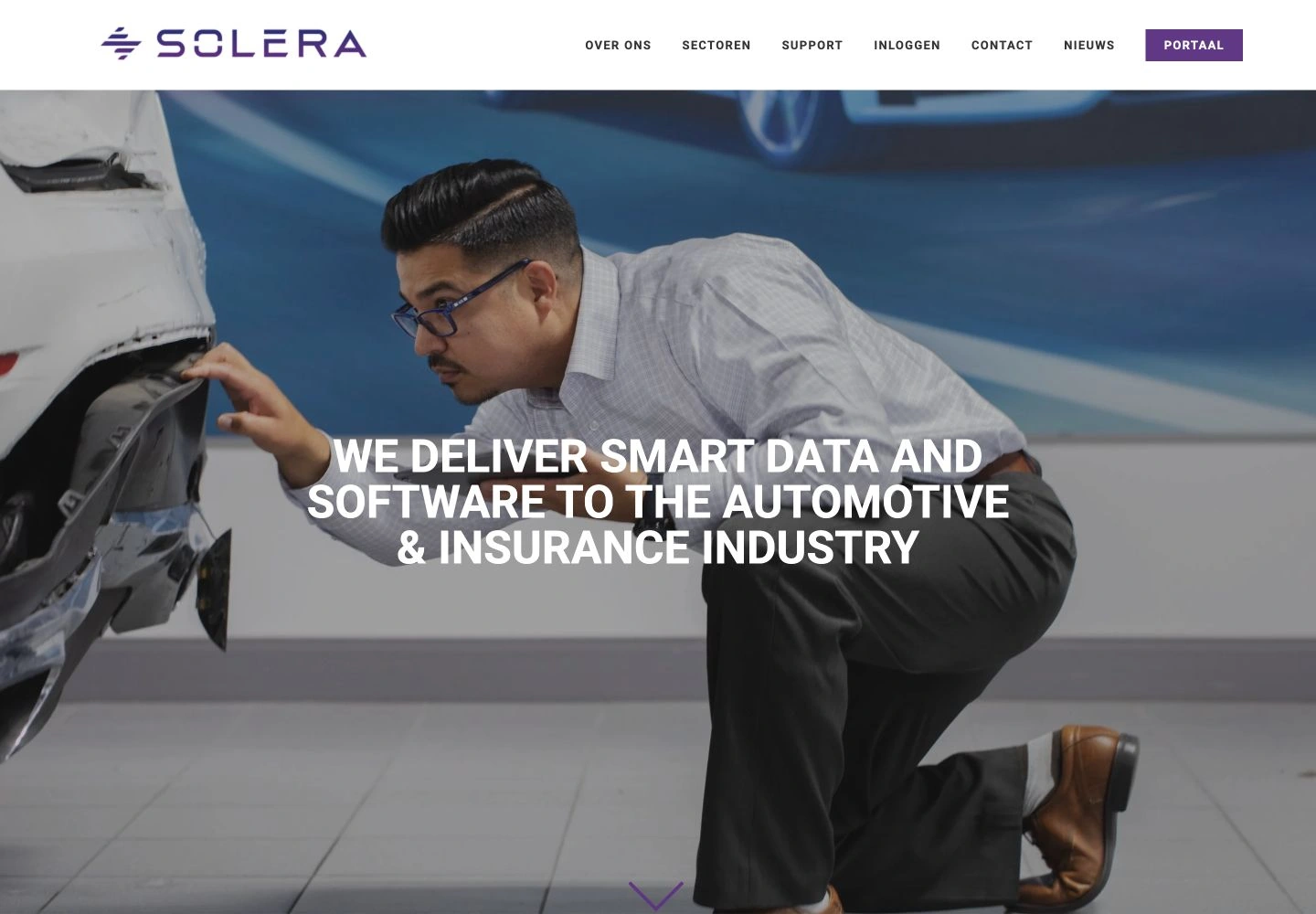
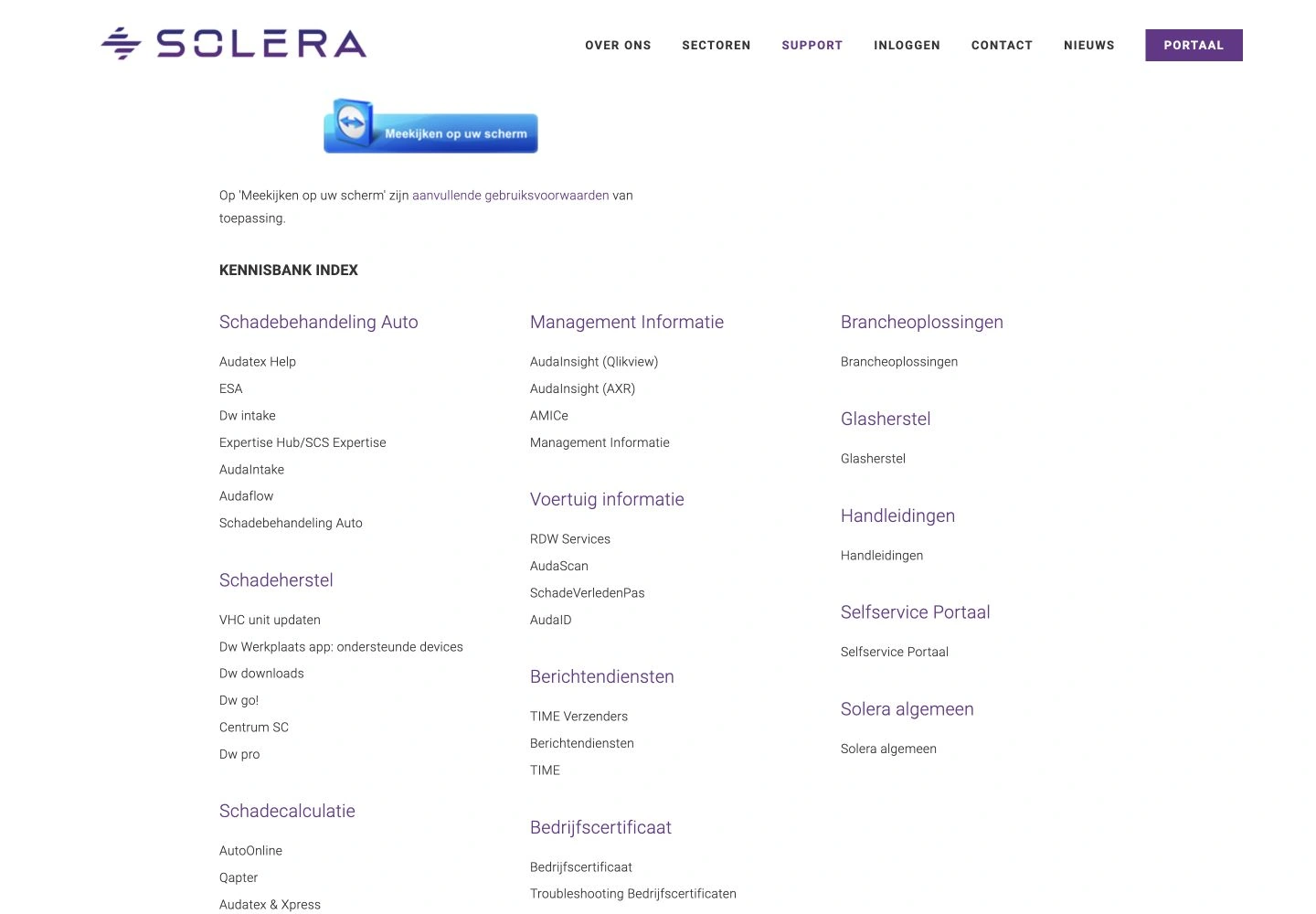
I built the complete solera.nl website in Squarespace. Alongside the website design and build, I structured the knowledge base as a collection of blog posts organised by product.
That structure allowed each product owner to maintain their own content within a shared website, rather than depending on a designer for every update.
Solera.nl: website design and Squarespace build.The knowledge base: a shared index linking to product-specific posts.
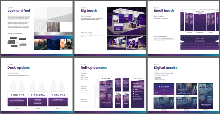
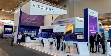
With more than 100 products in the Solera portfolio, each event needed to present a relevant selection within a recognisable brand. I developed a modular booth menu with the design team and stand builder, applying the new global identity to different event formats across multiple countries.
A modular booth system in the new global identity.Different configurations within one system.
09 / PEOPLE & ORGANISATION
Design is a team effort.
As Team Lead Concept Designers, I coordinated the workload of a three-person concept design team within Solera’s global design organisation and reported to the Creative Director.
I defined the SharePoint structure with the Office Manager: departmental pages, information hierarchy and content. We then handed day-to-day ownership to the teams.
“Coen leads by example and many people at Solera find his enthusiasm and dedication both inspiring and motivating.”Audrey River · Marketing Manager, Solera LinkedIn recommendation, excerpt